Search
Design and styling
Create a look-and-feel that perfectly matches your brand
Customizing your theme
-
Using Google fonts in your theme
The following steps allow you to take advantage of the large range of custom fonts offered by Google.
-
Navigate to
fonts.google.comin your browser to access the font library.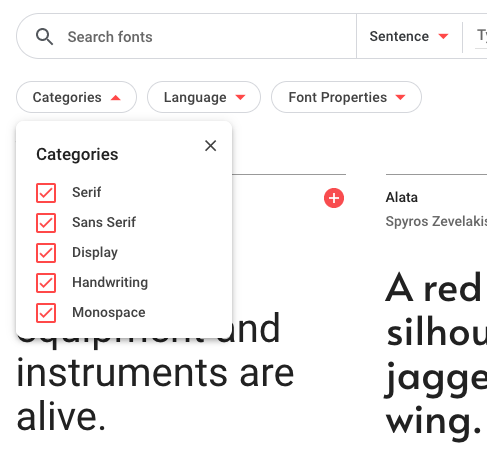
The Google Fonts directory If you know the type of font that you’re interested in, use the Categories filter to reduce the number of options presented.
-
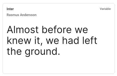
Select the desired font family.
-
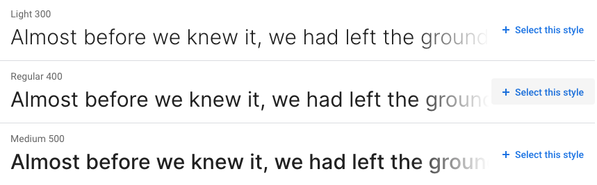
Select the font style(s) required for your Help Center.
-
Repeat the steps above for other font families, if required. Once the required font families and styles have been selected, click on Embed in the right-hand sidebar.
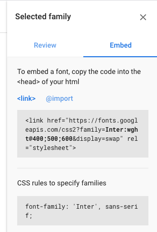
- Copy the embed
<link>into yourdocument_head.hbstemplate. -
Use the provided CSS rules to use your new font in CSS declarations:
.my-element {
  font-family: 'Inter', sans-serif;
}
-
-
Branding your Help Center
You can change the look-and-feel of the Help Center using theme setting controls including color pickers and font choosers. For example, you can change the logo, colors and fonts to bring your Help Center into line with your company’s branding guidelines.
In addition to updating branding with options in the Settings panel, you can control search behavior and whether or not certain page elements like comments appear.
Updating colors
By default, there are seven colors you can change in your Help Center, including:
- Primary color
- Primary text color
- Heading color
- Text color
- Link color
- Outline color
- Background color
To update your Help Center colors
- In Guide, click the Customize design icon (
 ) in the sidebar.
 - Click the theme you want to update. The theme page opens.
-
In the Settings panel, click Colors.

-
Click the color box beside any of the options, then use the color selector to chose a color or manually enter the number for your color.
The color updates in the preview window.
Click away from the color box and the color choice is saved.
- Repeat for other colors you want to change.
-
When you’ve finished updating your colors, click Publish.
The changes are applied to the theme.
- Click Back to return to the Themes page.
Updating fonts
You can change the font for headings and text by default. A list of several built-in font options are available to you.
To update your Help Center fonts
- In Guide, click the Customize design icon () in the sidebar.
- Click the theme you want to update. The theme page opens.
- In the Settings panel, click Fonts.
-
To change the heading font, click the drop-down menu under Heading, then select a font for your heading.
The font updates in the preview window.
-
To change the text font, click the drop-down menu under Text, then select a font for the text.
The font updates in the preview window.
-
When you’ve finished updating your fonts, click Publish.
The changes are applied to the theme.
- Click Back to return to the Themes page.
See Using Google fonts in your theme tp learn about how to use Google Fonts with your theme instead of websafe system fonts.
Updating the logo and favicon
You can change the logo and favicon for your Help Center. The logo appears in the header for your Help Center. The favicon is the small image displayed in the browser tab and next to the URL in the browser’s address bar.
For information on uploading your own images and other branding assets to use here, see Uploading and using your own assets.
To update the logo and favicon your Help Center theme
- In Guide, click the Customize design icon () in the sidebar.
- Click the theme you want to update. The theme page opens.
- In the Settings panel, click Brand.
-
If you want to change the logo, under Logo, click Replace to browse to and select an image.
The recommended image size is 200px by 50px. For the Copenhagen theme, the recommended maximum height is 37px.
If the width or height of the image exceeds the recommended size, the image is scaled down to keep the aspect ratio constant. The image background should be transparent or match the background color of the header.
-
If you want to change the favicon, under Favicon, click Replace to browse to and select an image.
For best results, make sure the favicon is a square image. The image is scaled to fit the display dimensions.
- To change back to the default image for the logo or favicon, click Revert.
-
When you’ve finished updating your logo or favicon, click Publish.
The changes are applied to the theme.
- Click Back to return to the Themes page.
Updating the images for your theme
The standard Copenhagen theme comes with three images that you can replace:
-
Hero image, appears at the top of the home page (in the default Copenhagen Plus theme)

-
Community hero image, appears at the top of the Community topics page (in the default Copenhagen Plus theme)

To update the images in your theme
- In Guide, click the Customize design () icon in the sidebar.
- In the Settings panel, click Images.
-
Under any of the images that appear in the Settings panel, click Replace to browse to and select an image.
-
For the Hero image the recommend size is 1600x300px.
You can use an image that is less than 1600px wide if you are concerned about load time, but ensure that your image is at least 300px in height so that is does not appear stretched. If the image exceeds the recommended size, the image is scaled to keep the aspect ratio constant and a maximum height of 300px.
-
For the Community banner, the height should be less than 300px to avoid stretching.
The image appears in the Settings panel. If you don’t want to use the image, you can click Revert to go back to the default image.
-
- Repeat for the other images, if you want to replace them.
-
When you’ve finished updating your images, click Publish.
The changes are applied to the theme.
- Click Back to return to the Themes page.
-
Editing CSS and JavaScript
You can customize your Help Center’s stylesheet and add your own custom JavaScript code. For tips, tricks and other helpful resources, refer to the following articles:
Custom themes are not supported by Zendesk and are not automatically updated when new features are released. See The difference between standard and custom themes.
Customizing CSS or JavaScript
The following steps describe how to edit your theme’s CSS and JavaScript within Zendesk Guide.
- In Guide, click the Customize design icon () in the sidebar.
- Click the theme you want to edit to open it.
-
Click Edit Code.

-
Click script.js to modify the JavaScript or style.css to modify the CSS.
The file opens in the code editor.
- Add or modify the JavaScript or CSS in the code view.
-
Click Save in the top right to save your changes.
The changes are applied to your theme.
-
To preview your changes, click Preview (see Previewing your theme in Help Center).

- Make other code changes as needed, then click Save.
When you’re finished, you can close the file.
- In Guide, click the Customize design icon (
-
Editing and compiling styles using Sass
When editing theme styles you can update the
style.cssfile directly, either through Zendesk Guide or locally using your favourite code editor. Alternatively, you can work with the Sass source files directly, which requires that you re-compile the styles once you have made your changes.Compiling Sass
Our themes all include a simple Ruby script for handling the Sass compilation step, which can be found in the
bin/folder. The script requires both Ruby and thesasscgem to be installed. Once you have installed Ruby by following these instructions, you can install thesasscgem using the shell commandgem install sassc.You can now compile your Sass files by running the command
./bin/compile.rbfrom your theme directory, which will take all the.scssfiles inside thescss/folder and create thestyle.cssfile that is used by Zendesk Guide. -
Using your own theme assets
You can upload assets, such as images and files, to any of your Help Center themes.
Uploading an asset for your theme
You can upload assets such as images and files to the Help Center. The assets are stored in a web cache in a cloud delivery network (CDN). Web caches reduce bandwidth requirements and server load, and improve response times.
There are a number of allowable file types for themes (see Allowable file types for theme assets).
To upload your own theme assets
-
In Guide, click the Customize design icon (
) in the sidebar. -
Click Customize on the theme you want to edit.
-
Click Edit code.
-
In the Assets section, click Add asset, then browse to select your file.

Theme asset names must be unique and cannot be more than 50 characters. Asset names can contain any of the following: letters, numbers, dot, minus, plus, underscore, and dash. Asset names are not case sensitive, so you cannot have an asset named asset.jpg and Asset.jpg.
The asset file is added to your list of asset files.
Allowable file types for theme assets
The following table shows the file types that are allowed as theme assets. The allowable files types for assets are limited to the file types used in the theming of a Help Center.
Asset type File types allowed Images jpg, jpeg, png, gif, svg, webp, tiff, tif, bmp, ico, webm Fonts woff2, woff, eot, otf, ttf, svg Text files js, css, html, json, txt, xml Other mp4, swf, wav, ogg. mp3 Rich content files types, such as Microsoft PowerPoint, Microsoft Word and PDFs, can be article attachments but cannot be theme assets.
Using uploaded assets in the theme’s code
You can reference an uploaded asset in the theme’s style.css file or in its templates. In style.css, you use asset path variables provided by Guide. In templates, you use the Curlybars asset helper.
Using asset variables and helpers in your code lets you easily replace the assets in the theme without editing the theme code. See Replacing an asset in your theme.
You can’t use the path variables or the helper in the theme’s script.js file.
To use an uploaded asset in your theme code
-
In Guide, click the Customize design icon (
) in the sidebar. -
Click Customize on the theme you want to edit.
-
Click Edit code.
-
In the Assets section, click the asset file you want to use.
Various expressions for the asset appear:

- Click Copy to copy the asset expression you need in the Clipboard.
- Paste the asset expression in your theme code.
Examples
style.css
.class-name {
  background: url($assets-backpack2-jpeg);
}
The value
assets-backpack2-jpegis a variable that contains the relative path to the asset..hbs files
In html markup:
<img src="{{asset 'backpack2.jpeg'}}">In a style tag:
<style>
  .class-name {
    background: url("{{asset 'backpack2.jpeg'}}");
  }
</style>
In a script tag:
<script>
  var assetsBackpack2 = "{{asset 'backpack2.jpeg'}}";
</script>
While you can insert the asset helper in a script tag in a template, you can’t use it in the script.js file.
For more information on editing your theme code, see Customizing your Help Center theme.
Replacing an asset in your theme
Using asset variables and helpers as described in Using uploaded assets in the theme’s code above lets you replace an asset in the theme dynamically without editing the theme code. You can update the theme just by selecting a new asset file on your system.
To replace an asset
-
In Guide, click the Customize design icon (
) in the sidebar. -
Click Customize on the theme you want to edit.
-
Click Edit code.
-
In the Assets section, click the asset file you want to replace.
-
Click the options menu on the upper-right side, then select Replace.

-
Select a new asset on your system.
Once uploaded, the theme is updated dynamically by any variable or helper that references the asset. The change is immediate.
The asset is not replaced if you used the full URL of the asset in the HTML source of published Help Center pages. The link to the asset will break because replacing an asset changes the asset’s published URL. As a result, avoid using the published asset URL in a theme, a page template, or an external web page.
Deleting a theme asset
You can easily delete any theme asset you’re no longer using in your theme.
To delete a theme asset
-
In Guide, click the Customize design icon (
) in the sidebar. -
Click Customize on the theme you want to edit.
-
Click Edit code.
-
In the Assets section, click the asset file you want to delete.
-
Click the options menu on the upper-right side, then select Delete asset.

-
Confirm that you want to delete the asset.
The asset is removed from your assets list.
-
-
Empty Article
Updating page templates
-
Rendering HTML using JavaScript
When Zendesk’s Curlybars templating language can’t generate the desired HTML, our JavaScript-based micro-templating system steps in.
A common use case for micro-templating is the creation of a category list that’s present on all pages in the Help Center. This is not possible out-of-the-box because the required template property, in this case an array of category objects, is only available on the Home page.
We offer a convenient way of fetching properties for use in JavaScript, so your imagination becomes the only constraint when creating new layouts and features within Zendesk Guide.
Usage
The micro-templating system requires a template string to generate HTML, which can be provided as a literal string of text or retrieved from a
<script>element.If a
<script>element is used, it should have an ID in the formattmpl-{template_name}. For example, thecustom-articles-listtemplate below renders a collection of articles:<script type="text/html" id="tmpl-custom-articles-list"> <% if (articles.length) { %> <ul class="list-unstyled"> <% articles.forEach(function(article) { %> <li class="list-item" id="<%= article.id %>"> <a href="<%= article.html_url %>"> <%= article.name %> </a> </li> <% }); %> </ul> <% } %> </script>Micro-templates are similar to the Curlybars templates used by Zendesk.
- Use
<% … %>to execute custom JavaScript code. This is often used to apply conditional logic or manipulate data. - Use
<%= … %>to print values to the screen. If the value should be HTML-escaped, use<%- … %>.
Micro-templates can be placed in any of the Zendesk Curlybars page templates and, as a result, you can reference all objects available on the page in the way that you normally would.
Via data attributes and plugins
Plugins that are responsible for rendering markup have a
templateoption that allows a custom template to be used instead of the default. For example, when using the Articles List plugin to render a list of articles you can specify a custom template (my-custom-template) using data attributes:<div data-element="articles-list" data-template="custom-articles-list"></div>Alternatively, the plugin can be initialized (and options set) using JavaScript:
<div id="articles-list"></div>

<script type="text/javascript">
  ready(function() {
    var articlesList = document.getElementById('articles-list');
    if (articlesList) {
      new Articles(articlesList, {
        template: 'custom-articles-list',
        templateData: { ... }
      });
    }
  });
</script>
All examples above require that a micro-templates exists on the page with an ID of
tmpl-{template_name}:<script type="text/html" id="tmpl-custom-articles-list'"> ... </script>Via JavaScript
Micro-templates can be rendered using the
renderTemplate()utility method.var articlesList = document.getElementById('articles-list'); var data = { "articles": [ ... ] }; Util.renderTemplate(articlesList, 'custom-articles-list', data); - Use
-
Understanding Guide templating
Guide templating, also known as the Templating API, is responsible for rendering the Help Center theme packages. This contains the Curlybars templating language that is used in the template files, CSS and JS files, and the manifest file.
To learn more about Guide themes, see Customizing your Help Center theme and the Help Center Templates developer documentation.
About Guide templating versions
Version 2 of the Templating API was released on February 24, 2020 and applies to the Copenhagen theme and any new theme releases. You can find out which version of the framework from the Customize design icon (
) in Guide (see Finding out the templating version).All Zenplates themes are built using the latest version of the Templating API which removes jQuery entirely to ensure themes remain fast and nimble. All custom functionality in our themes is written in vanilla JavaScript however if to use jQuery you can import the jQuery library.
For a full list of changes in version 2, refer to the online documentation.
Finding out the templating version
You can see the templating version from the Edit code view in your theme, or in the manifest file.
To check the templating version
- In Guide, click the Customize design icon () in the sidebar.
- Click the theme you want to see.
- Click Edit code.
-
Under the preview option, you’ll see the templating version number, for example, Templating API v1.
This version number corresponds with the
api_versionfield in the manifest file.
- In Guide, click the Customize design icon (
-
Customizing page templates with HTML and Curlybars
The HTML for the Help Center is contained in editable templates that define the layout of each page type, as well as the global header and footer. You can also use a full-featured templating language called Curlybars to access Help Center data and manipulate content in page templates.
On Guide Enterprise, you can create additional page templates for articles, sections, and categories if you need multiple versions of those templates.
You can customize the template of any of the following page types or elements:
- Article page (article_page.hbs): the individual article pages in the knowledge base
- Category page (category_page.hbs): landing pages
- Community post list page (community_post_list_page.hbs)
- Community post page (community_post_page.hbs)
- Community topic list page (community_topic_list_page.hbs)
- Community topic page (community_topic_page.hbs)
- Contributions page (contributions_page.hbs): the lists of posts, community comments, and article comments by an end-user
- Document head (document_head.hbs): the document’s head tag
- Error page (error_page.hbs): the message displayed when a user lands on a non-existent page
- Footer (footer.hbs): the bars appearing at the bottom of all Help Center pages
- Header (header.hbs): the bars appearing at the top of all Help Center pages
- Home page (home_page.hbs): the top-level landing page for your Help Center
- New community post page (new_community_post_page.hbs)
- New request page (new_request_page.hbs): the request or ticket submission form
- Request page (request_page.hbs): the individual request or ticket pages
- Requests page (requests_page.hbs): the lists of requests or tickets assigned to a user or that a user is CC’d on
- Search results (search_results.hbs): the search results display format
- Section page (section_page.hbs): landing pages
- Following page (subscriptions_page.hbs): the list of categories, sections, and articles a user is following
- User profile page (user_profile_page.hbs)
When you use the Theme Editor to edit the page templates, CSS, or JavaScript for a standard theme, or when you develop your own theme, it is saved as a custom theme. Custom themes are not supported by Zendesk and are not automatically updated when new features are released. See About standard themes and custom themes in Help Center.
To edit the page templates
-
In Guide, click the Customize design icon (
) in the sidebar. -
Click the theme you want to edit to open it.
-
Click Edit code.
-
In the Templates section, click the template you want to modify.
The page opens in the code editor.
-
Use the code view to edit the template.
You can add, remove, or reorder any the following:
- Template expressions to display and manipulate content in your pages
For example, the breadcrumbs template helper
{{breadcrumbs}}displays a breadcrumb navigation element on a page. For a detailed guide on template expressions, see Help Center Templates.- Dynamic content placeholders (see Adding translated text)
- Embeddable widgets created by third parties (such as the Twitter search widget)
- HTML markup
-
Click Save in the top right corner to save your changes.
The changes are applied to every page in your theme that is based on the template you modified.
-
To preview your changes, click Preview (see Previewing your theme in Help Center).
-
Make other code changes as needed, then click Save.
When you’re finished editing the page template, you can close it.
-
Using variables in CSS and HTML
The properties you choose in the Settings panel or set in your manifest file for colors, fonts, and theme images are stored in variables. You can use these variables in the theme’s style.css file. You can also reference the variables using Curlybars expressions in HTML page templates.
The variables are useful if you want to specify the same value in several places and update it quickly. Updating the property updates it everywhere the variable is used. You can change the names and labels, delete variables, or add your own (see the Settings manifest reference).
For a complete list of the default settings available in our themes, refer to our online documentation.
Examples using variables in CSS
The properties you set for colors, fonts, and theme images are stored in variables that you can use in your theme’s style.css file.
For example, you can use some of the default variables in CSS with the following syntax:
$primary_color$primary_inverse_color$heading_font$text_font
In the CSS file, you assign a variable to a CSS property the same way you would assign a normal value. For example:
.button {
  label-color: $text_font;
}
You can also use single curly brackets to embed the helper in a CSS expression, as follows:
max-width: #{$search_width}pxExamples using variables in Curlybars in HTML
The properties you set for colors, fonts, and theme images are stored in variables that you can reference with Curlybars expressions in HTML page templates.
The variables become properties of the
settings objectin Curlybars. As with any Curlybars object, you can use double curly brackets and dot notation to insert an property in a page template.For example:
-
{{settings.color_1}}is the HEX value of a color. For example: #FF00FF -
{{{settings.font_1}}is the font stack. For example, system is defined as: ‘-apple-system, BlinkMacSystemFont, ‘Segoe UI’, Helvetica, Arial, sans-serif” -
{{settings.homepage_background_image}}is the path to the file stored in this field. For example: p8.zdassets.com/theme_assets/… -
{{settings.range_input}}is the value of the range input.
The settings object can be used as input to any helper. For example:
{{is settings.enabled}} ... {{/is}} -
Adding multiple templates to your theme
By default, there is one page template each for article, section, and category in a theme. You can create up to ten additional page templates each for articles, sections, and categories.
This means that you can create alternate versions of templates to use for your articles, sections, and categories. You can apply or change the page template when you create or edit an article, section, or category.
You must have Guide Enterprise and you must be a Guide Manager to create multiple templates.
Adding multiple templates using the theme editor
You can create additional page templates for articles, sections, and categories using the theme editor in Guide. If you prefer working on your themes locally, you can also add templates to your exported themes.
To add an article, section, or category template using the theme editor
-
In Guide, click the Customize design icon (
) in the sidebar.Your themes appear on the Themes page.
- Hover your mouse over the theme you want to edit, then click View theme.
-
Click Edit Code.
-
Scroll to the bottom of your templates list, then click Add new template.

-
Under Template for, select the type of template you’d like to create.
You can create article, section, and category templates only. You can create up ten additional templates for each type.
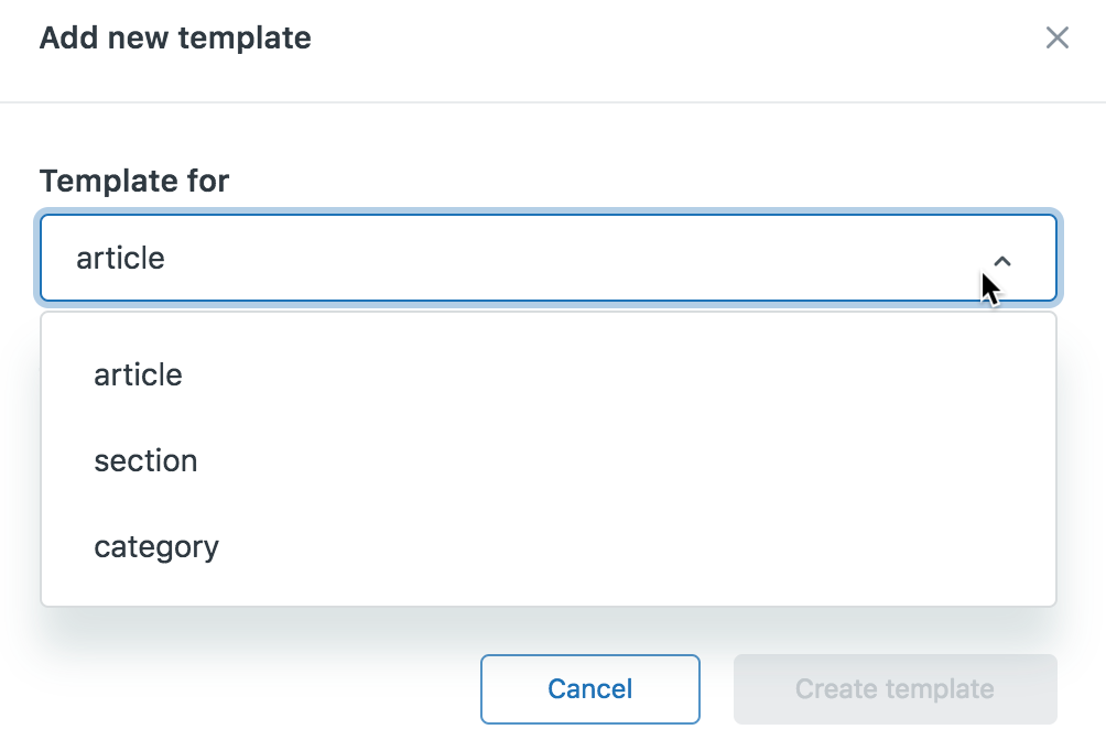
Add a new template - Enter a Template name.
-
Under Start from, select an existing template to copy and use as a starting point.
You can select blank template if you don’t want to start from another template.
-
Click Create template.
The new template opens for you.
- Edit your template and click Save as you go.
-
To preview your template, click Preview, then click Templates at the top of the preview and select the template you want to preview.
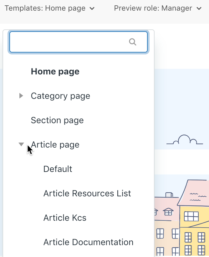
Preview a template For more information, see Previewing your theme while editing theme code.
When you are ready, you can apply your template to a new article or new category or section. You can also change the template on an existing article, section, or category.
Adding multiple templates in exported themes
If you export and work on themes locally, you can add multiple templates to the themes. The workflow consists of creating a predefined folder in a theme’s templates folder, then adding .hbs template files to the folder.
To learn more about working on themes locally, see Working on a theme locally.
To add a template to an exported theme
-
Depending on the type of template you want to add (article, section, or category), create any of the following folders in the templates folder of the exported theme:
- article_pages
- section_pages
- category_pages
As in the Guide theme editor, you can only create article, section, and category templates.
-
Add an .hbs template file in the new folder.
You can name the file anything you want. The name must be 25 characters or less, and snake_case.

To save time, copy an existing .hbs file into the folder to use as a starting point for the new template.
- Edit and save the template.
- If you need to add more templates of the same type, add them to the same folder.
- When you’re done, zip the theme and import it into Guide.
Use Guide to preview the new template.
When you are ready, you can apply your template to a new article or new category or section. You can also change the template on an existing article, section, or category.
-
-
Changing page templates in Guide
In a Guide theme, there is one page template each for article, section, and category by default. On Guide Enterprise, Guide managers can create additional templates for article, sections, and categories. If your live theme has multiple templates for these template types, you can change the template for an article, section, or category at any time.
Agents can change the template on any article they have permission to edit. You must be a Guide Manager to change the template for a section or category.
Changing the template for an article
If you have multiple article templates in your live theme, you apply a template when you create a new article. You can change the template on an existing article at any time.
Agents can change the template on any article they have permission to edit.
To change the template for an article
-
In Help Center, navigate to the article you want to edit, then click Edit article in the top menu bar.

Alternatively, in Guide, click the Manage articles (
 ) icon in the sidebar, then select an article from an article list to open it in edit mode.
 -
In the sidebar, click Article settings.
-
Click the Template menu, then select a template.
You might have to scroll down to see this option.

-
Click Save.
The live article is updated with the new template. You cannot preview this change in the article editor.
Changing the template for a category or section
If you have multiple category or section templates in your live theme, you apply a template when you create a new category or section. You can change the template on an existing category or section at any time.
You must be a Guide Manager to change the template for a section or category.
To change the template for a category or section
-
In Help Center, navigate to the category or section you want to edit, then click Edit category or Edit section in the top menu bar.

Alternatively, in Guide Admin, click the Arrange content (
 ) icon in the sidebar, then click the title of the category or section to open it in edit mode.
 -
In the sidebar, click the Template menu, then select a template.

-
Click Update.
The live category or section is updated with the new template.
-
Adding visually engaging elements to content
-
Increasing engagement with icons
Instead of bloating our themes with extra font files containing icons that you may or may not use, we inline SVG icons which offer better page load performance and improved accessibility over font-based icon systems. Zendesk’s default Copenhagen theme recently made the same change with the release of the new theming API.
Our Icons page contains an excellent starter set of icons and there are many collections (and thousands of icons) available online for free like Bootstrap Icons, Heroicons and Icons8.
For more information about the differences between font-based and inline SVG icons, refer to this article.
Usage
Use
.svg-iconwith an inline SVG icon to make it scale in relation to surrounding text.Heading 1
Heading 2
Heading 3
A paragraph of text
<h1 class="my-4">Heading 1 <svg class="svg-icon">...</svg></h1>
<h2 class="my-4">Heading 2 <svg class="svg-icon">...</svg></h2>
<h3 class="my-4">Heading 3 <svg class="svg-icon">...</svg></h3>
<p>A paragraph of text <svg class="svg-icon">...</svg></p>
A variety of different icons are included within each of our themes, which you can mix-and-match.
Some examples of commonly used SVG icons include:
thumbs-up
thumbs-down
star
pin
chevron-up
chevron-right
chevron-down
chevron-left
arrow-up
arrow-right
arrow-down
arrow-left
gear
Sizes
Use font size or sizing utilities can be used to control how large an icon appears.
<svg class="svg-icon text-red-500"></svg>
<svg class="svg-icon text-red-500 font-size-2xl"></svg>
<svg class="svg-icon text-red-500 h-6 w-6"></svg>
Colors
Use
.fill-currentor.stroke-currentto set the fill or stroke color of the SVG to the current text color. Text color utilities can then be used to control the color of an icon.<svg class="svg-icon font-size-2xl fill-current p-2 text-red-500"></svg> <svg class="svg-icon font-size-2xl fill-current p-2 text-green-500"></svg> <svg class="svg-icon font-size-2xl fill-current p-2 text-orange-500"></svg> <svg class="svg-icon font-size-2xl fill-current p-2 text-gray-600"></svg> -
Drawing attention to information with call outs
A great way to highlight important aspects of your content is to use callouts. These are typically expressed as tips or notes, though the specific language used should be consistent with your company’s brand.
This is an example of a standard note available in all themes. You can apply this style to any content by simply applying the
.noteclass name to a paragraph or container element.<p class="note"> This is an example of a standard note available in all themes. You can apply this style to any content by simply applying the <code>.note</code> class name to a paragraph or container element. </p>Warning styles can help draw visitor attention to important information:
This is an example of a standard warning available in all themes. You can apply this style to any content by simply applying the
.warningclass name to a paragraph or container element.<p class="warning"> This is an example of a standard warning available in all themes. You can apply this style to any content by simply applying the <code>.warning</code> class name to a paragraph or container element. </p>Different styles can be created using custom CSS or utilities.
Caution
This is an example of a custom notification using utilities. You can easily customize this to suit the look-and-feel of your theme or create your own.
<div class="border-left border-4 bg-orange-100 text-orange-600 border-orange-500 px-5 py-1 mb-4">
  <h4 class="text-inherit text-orange-500 mt-4 mb-2">
    Caution
  </h4>
  <p>
    This is an example of a custom notification using utilities. You can easily
    customize this to suit the look-and-feel of your theme or create your own.
  </p>
</div>
Each style can be used with our set of font and SVG icons to add extra visual appeal.
Boxes
Information that’s related to the main content of the page but more of an aside can be displayed within a box. As with all of our patterns, you can customize the appearance to meet your requirements using our utilities (for example, box shadows).
In summary
- This was an important point
- As was this
- And even this
- The final and most important point
<div class="px-6 py-4 border border-radius shadow-xs"> <h3> In summary </h3> <ul class="list-check my-5"> <li class="list-item">This was an important point</li> <li class="list-item">As was this</li> <li class="list-item">And even this</li> <li class="list-item">The final and most important point</li> </ul> </div> -
Getting technical with code blocks
The
<code>and<pre>elements are for displaying inline and multiline blocks of code.Usage
Use the
<code>element for inline code snippets.Thepush()method adds one or more elements to the end of an array and returns the new length of the array.<p>The <code>push()</code> method adds one or more elements to the end of an array and returns the new length of the array.</p>Use the
<pre>element for multiple lines of code.L TE A A C V R A DOU LOU REUSE QUE TU PORTES ET QUI T' ORNE O CI VILISÉ OTE- TU VEUX LA BIEN SI RESPI RER - Apollinaire<pre> L TE A A C V R A DOU LOU REUSE QUE TU PORTES ET QUI T' ORNE O CI VILISÉ OTE- TU VEUX LA BIEN SI RESPI RER - Apollinaire </pre>Use
<kbd>for input that is typically entered via keyboard.To edit settings, press ctrl + s<p>To edit settings, press <kbd>ctrl</kbd> + <kbd>s</kbd></p> -
Adding figures and images to articles
Use the
<figure>element to display self-contained content, like illustrations, images, photos or code. For image-specific styles, refer to the Images page.Usage
Use the
<figcaption>element to display a caption for a given<figure>.This is a caption for the image. <figure> <img class="img-fluid" src="..." alt="..."> <figcaption class="mt-4">This is a caption for the image.</figcaption> </figure>Use text align utilities to align the caption relative to the image.
This is a caption for the image. <figure> <img class="img-fluid" src="..." alt="..."> <figcaption class="mt-4 text-right">This is a caption for the image.</figcaption> </figure>Image styles
Images often play an important role in content, providing useful information and helping to illustrate points. Images can be displayed within
<figure>elements and given an optional caption using the<figcaption>element.A full-width centered image Using a few simple class names, you can change the alignment of your images and even have them extend slightly beyond the content area for added effect.
A left-aligned image Use
.float-leftto have an image float to the left of the content. Responsive variants allow you to control the float based on screen size.There should be some space above, below and on the appropriate side of the image to ensure separation between the image and surrounding text. This will make the page look better and improve readability.
Margin utilities allow you to apply spacing around the image and reposition the element on larger screen sizes. Text alignment utilities can be used to control the alignment of the caption.
The left-aligned example uses
.my-5and.lg:mr-6to apply margin around the entire element andlg:-ml-6to shift the image further to the left on large screen sizes.Use
.float-rightto achieve a similar (but opposite) effect. Consider using other utilities, for example borders and background colors, to add further interest to your images or apply your own styles to figures or images within the content area (.content) using custom CSS.When floating elements it may occasionally be necessary to use
.clearfixto ensure content remains within the content area. -
Customizing list styles
Use
.list-unstyledto remove the default styling from<ol>and<ul>elements.- List item
- List item
- List item
<ul class="list-unstyled">
  <li>List item</li>
  <li>List item</li>
  <li>List item</li>
</ul>
Use
.list-itemto add additional space around each list item.- List item
- List item
- List item
<ul class="list-unstyled"> <li class="list-item">List item</li> <li class="list-item">List item</li> <li class="list-item">List item</li> </ul>- Lorem ipsum dolor sit amet, adipiscing elit.
- Nulla vitae elit libero, a pharetra augue.
- Donec id elit non mi porta gravida at eget metus.
- Quisque fringilla elit quis purus consectetur.
<ul>
  <li class="list-item">Lorem ipsum dolor sit amet, adipiscing elit.</li>
  <li class="list-item">Nulla vitae elit libero, a pharetra augue.
    <ul>
      <li class="list-item">Donec id elit non mi porta gravida at eget metus.</li>
      <li class="list-item">Quisque fringilla elit quis purus consectetur.</li>
    </ul>
  </li>
</ul>
List style utilities provide additional control over the look-and-feel of lists.
Numbered list
Use
.list-numberto apply a custom numbered style to a list.- List item
- List item
- List item
<ol class="list-number">
  <li class="list-item">List item</li>
  <li class="list-item">List item</li>
  <li class="list-item">List item</li>
</ol>
Check list
Use
.list-checkto apply a custom checklist style to a list.- List item
- List item
- List item
<ul class="list-check">
  <li class="list-item">List item</li>
  <li class="list-item">List item</li>
  <li class="list-item">List item</li>
</ul>
Divider list
Use
.divider-listto present list items in a horizontal list separated by a divider.- List item
- List item
- List item
<ul class="list-divider">
  <li>List item</li>
  <li>List item</li>
  <li>List item</li>
</ul>
The
data-dividerattribute allows you to override the divider applied before a given list item:- List item
- List item
- List item
<ul class="list-divider">
  <li>List item</li>
  <li data-divider=">">List item</li>
  <li data-divider="/">List item</li>
</ul>
We use this element in our themes to present call-to-actions, menus and lists of articles.
-
Emphasizing points with block and pull-quotes
Blockquotes
Use
<blockquote>for quoting blocks of content from another source within your document.Success is not defined by the ability to have no complaints, it is defined by the ability to deal with them.
<blockquote class="font-size-lg">
  <p>
    Success is not defined by the ability to have no complaints, it is defined by the ability to deal with them.
  </p>
  <footer class="text-gray-500">
    Mikkel Svane in <cite title="Source Title">Startupland</cite>
  </footer>
</blockquote>
Pull-quotes
You can also emphasize parts of your content using utilities or your own custom elements. The following paragraphs help prove this point by providing a body of text in which a pull-quote can be placed.
“Your most unhappy customers are your greatest source of learning.”
You’ll notice that the quote itself is made larger and bolder using typography utilities. Space is added around the element and, on large screens, shifted left using margin utilities.
There’s really no limit to what you can do with our utilities. Of course you could create a right-aligned version that looked much the same, or create your own unique versions.
Draw inspiration from what you see online, get excited and get creating!
- See all 8 articles


Enhancing content with interactive elements
-
Using tabs to organize content
Tabs are a navigation element that allow users to easily access different parts of a page, or even other parts of the Help Center. They are commonly used on the Web and, as a result, intuitive.
Use tabs to group content, create relationships between related information and as a tool to save space.
Usage
Creating tabs within your articles is easy:
- When editing an existing article, create a list (
<ul>or<ol>element) and click the Source Code ( ) button on the editor toolbar to view the source code of the page.
 - Add the
data-element="tabs"attribute to the list element. - Add optional tab titles to each list item using the
data-titleattribute.
Mauris ipsum. Nulla metus metus, ullamcorper vel, tincidunt sed, euismod in, nibh. Quisque volutpat condimentum velit. Class aptent taciti sociosqu ad litora torquent per conubia nostra, per inceptos himenaeos. Nam nec ante. Sed lacinia, urna non tincidunt mattis, tortor neque adipiscing diam, a cursus ipsum ante quis turpis.
Lorem ipsum dolor sit amet, consectetur adipiscing elit, sed do eiusmod tempor incididunt ut labore et dolore magna aliqua. Ut enim ad minim veniam, quis nostrud exercitation ullamco laboris nisi ut aliquip ex ea commodo consequat. Duis aute irure dolor in reprehenderit in voluptate velit esse cillum dolore eu fugiat nulla pariatur. Excepteur sint occaecat cupidatat non proident, sunt in culpa qui officia deserunt mollit anim id est laborum.
Lorem ipsum dolor sit amet, consectetur adipiscing elit. Integer congue justo a metus bibendum dapibus. In imperdiet interdum tincidunt. Nam odio dolor, hendrerit vel eros non, viverra pellentesque tellus. Proin ac elit in leo faucibus gravida. Donec ut neque non augue porttitor mollis a quis eros.
<ul data-element="tabs"> <li data-title="The first tab"> <p>Mauris ipsum. Nulla metus metus, ullamcorper vel, tincidunt sed, euismod in, nibh. Quisque volutpat condimentum velit. Class aptent taciti sociosqu ad litora torquent per conubia nostra, per inceptos himenaeos. Nam nec ante. Sed lacinia, urna non tincidunt mattis, tortor neque adipiscing diam, a cursus ipsum ante quis turpis.</p> </li> <li data-title="The second tab"> <p>Lorem ipsum dolor sit amet, consectetur adipiscing elit, sed do eiusmod tempor incididunt ut labore et dolore magna aliqua. Ut enim ad minim veniam, quis nostrud exercitation ullamco laboris nisi ut aliquip ex ea commodo consequat. Duis aute irure dolor in reprehenderit in voluptate velit esse cillum dolore eu fugiat nulla pariatur. Excepteur sint occaecat cupidatat non proident, sunt in culpa qui officia deserunt mollit anim id est laborum.</p> </li> <li data-title="The third tab"> <p>Lorem ipsum dolor sit amet, consectetur adipiscing elit. Integer congue justo a metus bibendum dapibus. In imperdiet interdum tincidunt. Nam odio dolor, hendrerit vel eros non, viverra pellentesque tellus. Proin ac elit in leo faucibus gravida. Donec ut neque non augue porttitor mollis a quis eros.</p> </li> </ul> - When editing an existing article, create a list (
-
Making content easy to find with toggles and accordions
Toggles and accordions are a common element in web design. They allow for progressive disclosure — the ability to highlight important sections of content and allow visitors to reveal additional details with a click.
Accordions look and behave exactly like toggles except for the fact that only one within a given section can be open at a time.
Usage
Creating toggles within your articles is easy:
- When editing an existing article, create a list (
<ul>or<ol>element) and click the Source Code () button on the editor toolbar to view the source code of the page. - Add the
data-element="togggles"attribute to the list element. - Add optional tab titles to each list item using the
data-titleattribute. - To have the group of toggles behave as an accordion, use the
data-accordion="true"attribute.
-
The first toggles
Mauris ipsum. Nulla metus metus, ullamcorper vel, tincidunt sed, euismod in, nibh. Quisque volutpat condimentum velit. Class aptent taciti sociosqu ad litora torquent per conubia nostra, per inceptos himenaeos. Nam nec ante. Sed lacinia, urna non tincidunt mattis, tortor neque adipiscing diam, a cursus ipsum ante quis turpis.
-
The second toggles
Lorem ipsum dolor sit amet, consectetur adipiscing elit, sed do eiusmod tempor incididunt ut labore et dolore magna aliqua. Ut enim ad minim veniam, quis nostrud exercitation ullamco laboris nisi ut aliquip ex ea commodo consequat. Duis aute irure dolor in reprehenderit in voluptate velit esse cillum dolore eu fugiat nulla pariatur. Excepteur sint occaecat cupidatat non proident, sunt in culpa qui officia deserunt mollit anim id est laborum.
-
The third toggles
Lorem ipsum dolor sit amet, consectetur adipiscing elit. Integer congue justo a metus bibendum dapibus. In imperdiet interdum tincidunt. Nam odio dolor, hendrerit vel eros non, viverra pellentesque tellus. Proin ac elit in leo faucibus gravida. Donec ut neque non augue porttitor mollis a quis eros.
<ul data-element="toggles" data-accordion="true"> <li data-title="The first toggles"> <p>Mauris ipsum. Nulla metus metus, ullamcorper vel, tincidunt sed, euismod in, nibh. Quisque volutpat condimentum velit. Class aptent taciti sociosqu ad litora torquent per conubia nostra, per inceptos himenaeos. Nam nec ante. Sed lacinia, urna non tincidunt mattis, tortor neque adipiscing diam, a cursus ipsum ante quis turpis.</p> </li> <li data-title="The second toggles"> <p>Lorem ipsum dolor sit amet, consectetur adipiscing elit, sed do eiusmod tempor incididunt ut labore et dolore magna aliqua. Ut enim ad minim veniam, quis nostrud exercitation ullamco laboris nisi ut aliquip ex ea commodo consequat. Duis aute irure dolor in reprehenderit in voluptate velit esse cillum dolore eu fugiat nulla pariatur. Excepteur sint occaecat cupidatat non proident, sunt in culpa qui officia deserunt mollit anim id est laborum.</p> </li> <li data-title="The third toggles"> <p>Lorem ipsum dolor sit amet, consectetur adipiscing elit. Integer congue justo a metus bibendum dapibus. In imperdiet interdum tincidunt. Nam odio dolor, hendrerit vel eros non, viverra pellentesque tellus. Proin ac elit in leo faucibus gravida. Donec ut neque non augue porttitor mollis a quis eros.</p> </li> </ul> - When editing an existing article, create a list (
Customizing CSAT
-
Understanding CSAT
Your customers can provide feedback about their support experience by rating their solved tickets. When you enable CSAT (customer satisfaction ratings), end-users receive an email 24 hours after the ticket has been set to solved that asks them to briefly evaluate their experience, as shown here:

The survey is designed to maximize the response rate by being quick and simple while also gathering the essential data: a positive or negative rating. Customers can also provide a comment if they want. You can view your overall score and individual ratings in the Customer Satisfaction dashboard (see Viewing your Customer Satisfaction score and ratings).
Customer satisfaction rating is available with Support Professional and Enterprise plans. You must be an administrator to enable customer satisfaction ratings.
Understanding the end-user experience
End-users don’t have to be logged in to rate their tickets. Clicking a response link in the email opens a URL to the ticket and prompts the end-user to rate the ticket and add a comment if they’d like. In this example, the end-user clicked the ‘Good, I’m satisfied’ link so the Good button is shaded green to indicate that it is the selected rating. A comment can be added and the rating can be changed.
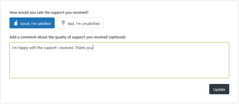
If you have satisfaction reasons enabled, end-users who select ‘Bad, I’m unsatisfied’ are presented with a drop-down menu of possible reasons for their negative response.

Selecting a response is optional, and can be skipped. For information on this feature, see Working with satisfaction reasons.
In Help Center, the rating prompt appears on tickets for which the Ticket Satisfaction is set to Offered by an automation or trigger. For more information, see Understanding how the survey request is sent.
End-users can change their rating by clicking the emailed link again or by accessing the ticket through the My activities page in Help Center, then resubmitting their response. Ratings can be changed until the ticket is closed. See Tracking your support requests for information on viewing your tickets in Help Center.
Dylan Dimico shares some tips and tricks on changing your bad satisfaction ratings to good. Check it out in Changing bad satisfaction ratings to good.
The following rules apply to end-users when using satisfaction rating:
- End-users cannot opt-out of receiving survey requests.
- Satisfaction rating is per ticket, not per customer. End-users receive a survey request for each of their tickets that are solved.
- Once a ticket is set to “Closed” status, the temporary URL will no longer work. It will re-direct the user to a generic page.
When and how end-users are asked for a satisfaction rating through email is customizable. You can set a time other than the default 24 hours later for to send the email. You can also add the survey request in the email that customers receive when a an agent marks a ticket as solved instead. You can also use business rules to be more selective about (include or exclude) which tickets generate the survey request. If you send a satisfaction survey before the ticket is solved, end users need to sign in to access it.
Understanding how the survey request is sent
When you enable customer satisfaction rating (see Enabling customer satisfaction rating), a system-generated automation called Request customer satisfaction rating is added to Zendesk Support. This automation sends the survey email to the ticket requester 24 hours after the ticket is solved. You can of course customize this.
The email body in the automation uses a placeholder called
{{satisfaction.rating_section}}to insert the survey question into the message, as shown here:Hello {{ticket.requester.name}}, We'd love to hear what you think of our customer service. Please take a moment to answer one simple question below: {{satisfaction.rating_section}} Here's a reminder of what your ticket was about: {ticket.comments_formatted}}When customers receive the email, they simply click either the Good or Bad links and follow the steps described above.
For more details about the automation, see Customer satisfaction rating automation.
As noted above, the survey is sent when the ticket is set to Solved. It’s possible to use a different status in the automation, such as Pending, but the ticket would have had to be set to Solved at least once before.
About the Request Customer Satisfaction Rating automation
The customer satisfaction rating automation, Request customer satisfaction rating (System Automation), sends the survey request email 24 hours after a ticket has been solved.
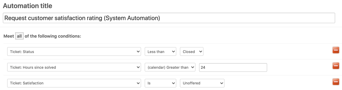
Remember that the condition statement is Hours since solved is 24 not Hours since solved greater than 24. This means that when you first enable customer satisfaction rating, none of the tickets that have been solved for more than 24 hours will generate a survey email. You can change this of course.
You might consider changing the number of hours after solved that you send out surveys to get more responses. Check out this blog post about maximizing survey responses.
You’ll notice that there’s a Ticket Satisfaction condition as well. This condition has the following values:
- Unoffered means that the survey has not previously been sent
- Offered means that the survey has already been sent
- Bad is the requester’s negative rating
- Bad with comment is the requester’s negative rating with their comment
- Good is the requester’s positive rating
- Good with comment is the requester’s positive rating with their comment
The unoffered value is used here because we only want to send the survey for tickets that have not already been rated.
The automation actions send the survey request email to the requester.

The
{{satisfaction.rating_section}}placeholder contains the rating question and answer links. You can modify the surrounding message as needed. And as always, a canceling action is used to complete the automation; ticket satisfaction is set to offered to requester.This automation can be modified to exclude tickets using many different criterion. For example, you might not want surveys sent for tickets assigned to a certain group or from a certain organization or for tickets containing certain tags.
Understanding how agents receive the customer satisfaction rating feedback
The results of customer satisfaction surveys for agents are shown in the agent’s dashboard and in a view called Rated tickets from the last 7 days.
Agents see, in their dashboard (when they click the Home icon (
 ) in the sidebar), the number of good and bad tickets for the last week and the overall satisfaction rating for the agent and all of the agents in Zendesk Support over the last 60 days (including the current day).
The calculation of the overall satisfaction rating uses the following simple formula:

This means that the score is an average of the total positive ratings from the past 60 days. An agent with a score of 90% means that over the past 60 days, 90% of the ratings they received were positive.
Agents, groups, and the account all have scores. The overall account score (in the example above, 95%) is the average for all agents in Zendesk Support. The two ratings provide feedback about individual performance and the average performance of all agents.
An overall rating score will not be shown until 30 tickets are rated. This applies at the agent, group, and account levels. This means that an agent needs 30 ratings, a group (all agents within the group) needs 30 ratings, and the account (all the agents in your Zendesk account) needs 30 ratings.
The view (Rated tickets from the last 7 days) gives you a quick overview of the rating activity, with a Satisfaction column containing both Good and Bad ratings. You can clone and modify this view or create your own. This view is inactivate by default.
The following rules apply to agents when using customer satisfaction rating:
- Agents cannot rate tickets.
- All agents see their ratings in their dashboard. This feature is enabled at the account level and applies to all agents in your Zendesk account. You cannot exclude individual agents from receiving ratings on the tickets they are assigned to.
Additionally, ratings cannot be moderated. All ratings are shown.
-
Displaying satisfaction ratings in the Help Center
You can display satisfaction ratings in your Help Center. This lets you show quick statistics based on your last 100 satisfaction ratings. The following data is shown:
- Number of positive ratings
- Number of negative ratings
- Overall score (percentage of good ratings)

The numbers are based on your last 100 ratings, so it’s a sliding window that is recalculated every time you receive a rating. The appearance and wording is customizable.
You must have Guide Professional and Support Professional or Enterprise to display satisfaction ratings and score in your Help Center.
Getting the code for the ratings box
You add the ratings box by pasting a code snippet into the HTML of a page or template. You must be an admin to get the code.
- Click the Admin icon (
 ) in the sidebar, then select Customers.
 - Click the Satisfaction tab.
-
Make sure that Allow customers to rate tickets is selected and that you have at least 100 ratings. If you don’t have at least 100 ratings, you’ll see the following message. In that case you have to wait until you get more ratings to use the ratings box.

- Select Allow me to display public satisfaction statistics.
-
Click Save Tab.
The page updates with more information, including statistics based on your last 100 customer satisfaction ratings.
- Under How do I use it, copy all the HTML code in the box. You’ll only see this HTML code if you if have 100 or more satisfaction ratings.
Adding the ratings box in the Help Center
Guide Managers can add the ratings box to articles or to the home page of the Help Center.
To add the ratings box to the home page of your Help Center
- In Guide, click the Customize design icon ( in the sidebar.
- Click the theme you want to edit to open it.
-
Click Edit Code.
- In the Templates section, open the home page template.
- Paste the code for the ratings box in the template.
- Click Save.
- Click Preview to preview the effect of your changes on the page.
To add the ratings box to an article in the Help Center
- In Guide, click the Settings icon (
 ) in the sidebar.
 -
Ensure the Display Unsafe Content setting is enabled.
In this case, you want to allow unsafe content like script tags.
- Back in the Help Center, navigate to the article where you want the ratings box to appear.
- Click Edit article.
- Switch to the HTML editor by clicking Source code button on the editor’s toolbar.
- Paste the code for the ratings box in the page and click Save.
The ratings box appears wherever you paste the code. If you want to customize the wording, the CSS, or place the box in a specific element on the page, see Customizing the ratings box below.
Customizing the ratings box
You can customize the satisfaction ratings box by changing the wording, changing the look, or setting where it appears on the page.
Customizing the wording
If you don’t like the default wording that appears under the three numbers in the ratings box, you can change it. In the ratings box code, look for the following values:
Satisfaction.show({
    strings: {
      goodRatings:      "Said good",
      badRatings:       "Weren't so sure",
      score:            "Overall happiness",
      zendeskPlug:      "Powered by <a href=\"http://www.zendesk.com/\">Zendesk</a>"
    }
});
You can edit the values in quotes.
Customizing the look
The code you pasted into your HTML imports a CSS stylesheet:
@import url(https://support.zendesk.com/stylesheets/public_satisfaction.css);If you want to customize the look of the ratings box, you an add your own CSS to the page where you put the ratings box, overwriting the CSS defined in the Zendesk stylesheet.
-
Customizing your customer satisfaction survey
One of Zendesk Support’s most popular features is the built-in customer satisfaction survey. Customer satisfaction allows you to track how well your agents and customer service organization as a whole are performing on a ticket by ticket basis.
Enabling the customer satisfaction feature
To enable customer satisfaction surveys, click the Admin icon (
) in the sidebar, then select Settings > Customers > Satisfaction.When you enable customer satisfaction, a pre-built automation is automatically created for you. To see this automation:
- Click the Admin icon () in the sidebar
- Select Business Rules > Automations
- Open Request customer satisfaction rating (System Automation).
It’s set up by default to send a customer satisfaction survey to your customers 24 hours after their ticket has been solved (not closed). We’ve found that this setup works really well for most companies that have a longer response cycle.
The default conditions for the system customer satisfaction automation:
Customizing when and how the customer satisfaction is requested
But that’s not the end of the story… you can customize the customer satisfaction survey to meet your needs. Customer satisfaction is really nothing but a placeholder that you can use in any notification sent out by a trigger or automation. Yes, Zendesk Support provides you with a system automation specifically for customer satisfaction, but you can modify it, or even remove it altogether and trade it in for a trigger.
As I pointed out earlier, the automation is defaulted to 24 hours. However, you can easily increase or decrease the length of time between when the ticket is solved and when the survey is sent by editing the automation:
If you’re taking advantage of user and organization tagging, you may want to send customer satisfaction to only a subset of your user base. For example, do you want to make sure users tagged with “partner” never get a customer satisfaction survey? Add this condition under “ALL”:
Are you afraid that users are receiving too much email? Consider combining the “solved” email notification with the customer satisfaction survey. To achieve this, simply deactivate the customer satisfaction automation, then go into triggers and edit your “solved” notification trigger. Add the customer satisfaction placeholder
{{satisfaction.rating_section}}into your notification. That’s it! Now your “solved” notification will include a customer satisfaction survey:Customizing the customer satisfaction email
If you want to customize the Satisfaction Survey section of the email notification, you can use system placeholders and HTML to do so. You’ll find the list of available placeholders in the Zendesk Support placeholders reference.
For example, the default
{{satisfaction.rating_section}}placeholder will return the following section:
If you use the
{{satisfaction.positive_rating_url}}and{{satisfaction.negative_rating_url}}placeholders plus custom HTML, you can transform the satisfaction section to something like this:
Zendesk can’t provide customer support for your custom HTML or CSS. Please post any issues you have in the comments section or try searching for a solution online.
Considerations
When customizing your customer satisfaction process, you’ll want to think about different situations, and what will work best for both you and your customers.
Are you more concerned about customers receiving too many emails? Consider combining customer satisfaction with another email. However, customer satisfaction may not get the attention (or response) when combined with other information.
Also consider the case that a ticket is inadvertently marked as solved, or is solved before the issue is actually resolved for the customer. Sending out the survey in combination could actually result in more negative ratings. Using an automation instead allows a period of time to pass, during which a customer could choose to reopen his or her ticket.
If your response cycles with support are typically shorter (e.g. most tickets take 5 minutes to answer), you may want to actually reduce the amount of time you wait before surveying customers. If your response cycles are measured in hour or days, 24 hours might be adequate. Timing is everything, and a perfectly timed customer satisfaction survey can truly help your response rate.
For more in-depth instructions on configuring Customer Satisfaction, see Using CSAT.
- Click the Admin icon (
-
Using CSAT
Enabling customer satisfaction ratings
By default, customer satisfaction ratings is disabled. You must be an administrator to enable it.
You can also enable satisfaction reasons, which allow you to add a follow-up question to negative survey responses.
To enable customer satisfaction ratings
- In Support, Click the Admin icon () in the sidebar, then click Settings > Customers.
- On the Satisfaction tab of the End-users (customers) page, click Allow customers to rate tickets.
Zendesk Support is now set up to send your end-users the customer satisfaction rating email. Enabling this also creates a new automation called Request customer satisfaction rating (System Automation) and a view called Rated tickets from the last 7 days. Both can be modified as needed to suit your workflow.
For information about using the Explore reports for customer satisfaction, see Viewing your Customer Satisfaction score and ratings.
Using customer satisfaction rating placeholders
Aside from the placeholder mentioned above,
{{satisfaction.rating_section}}, the customer satisfaction rating feature adds four other related placeholders. All of these placeholders can be used in various ways and are described in the following table.Placeholders are best used in triggers and automations. Inserting them into a macro or comment creates a plain text version of the CSAT request, which permits other users to submit a satisfaction score for the requester and requires end-users to click the URL and sign into your Help Center to complete the survey.
Table 1. Customer satisfaction rating placeholders
Placeholder Description {{satisfaction.rating_section}}A formatted block of text prompting the user to rate satisfaction. {{satisfaction.current_rating}}The text value of the current satisfaction rating, either Good or Bad. {{satisfaction.positive_rating_url}}A URL to rate the support positively. {{satisfaction.negative_rating_url}}A URL to rate the support negatively. {{satisfaction.rating_url}}A URL to rate the support (positive or negative are not pre-selected). {{satisfaction.current_comment}}The comment that the user added when rating the ticket. Reporting on customer satisfaction
You can view CSAT reports on the Satisfaction tab of the Explore Zendesk Support dashboard (see Overview of the Zendesk Support dashboard). If you are using Explore Professional, you can also build your own custom reports based on customer satisfaction data.
If you haven’t enabled Explore, view your score and ratings in the Satisfaction dashboard. For more information, see Viewing your Customer Satisfaction score and ratings.
- In Support, Click the Admin icon (
-
Working with satisfaction reasons
Applying satisfaction reasons to ticket views
You can create a ticket view to organize tickets by the satisfaction reason given, or to look tickets with a negative response and no satisfaction reason given.
The reasons included in your survey appear as condition elements in the views builder:
For information on building ticket views, see Using views to manage ticket workflow.
Applying satisfaction reasons to business rules
You can create business rules - triggers and automations - based on satisfaction reasons to draw attention to tickets with certain responses.
The reasons included in your survey appear as conditions in the triggers or automations builder:

For more information on triggers and automations, see the following articles:
-
Enabling and customizing satisfaction reasons
Customer satisfaction rating surveys allow you to measure how happy your customers are with the services you provide. Inevitably, you’re going to receive a less-than-glowing response (rare as it may be). You can learn about the issues behind a bad satisfaction rating by asking any customer who gives a negative survey response to select a reason for their dissatisfaction.
Enabling satisfaction reasons
Satisfaction reasons are managed through the Customers settings.
To enable satisfaction reasons
- Click the Admin icon () in the sidebar, then select Settings > Customers.
- On the End-users (customers) settings page, click the Satisfaction tab.
-
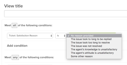
In the Configuration Options section, click the checkbox to enable Ask a follow-up question after a bad rating. This opens the satisfaction reasons picklist.

-
Click Save Tab to accept the default reasons:
- The issue took too long to resolve
- The issue was not resolved
- The agent’s knowledge is unsatisfactory
- The agent’s attitude is unsatisfactory
You can accept these reasons, or create customized reasons. See Customizing satisfaction reasons below for information.
Once enabled, customers who respond to your survey by selecting “Bad, I’m unsatisfied” see a follow-up question that asks “What is the main reason you are unsatisfied?”, with a drop-down menu to choose their reason:
This follow-up question is optional - customers can skip it by simply ignoring it and clicking Update - and it only appears to customers who select the response “Bad, I’m unsatisfied”.
Customizing and localizing satisfaction reasons
The default reasons address common, service-related issues customers may have, but these may not serve your needs. When you enable satisfaction reasons, you can customize the reasons offered to your customers to better reflect brand and product-specific language, unique customer experiences, and even cultural differences. You can also localize your custom reasons to reach customers in multiple languages.
Customizing the reasons list
There are any number of reasons why you may want to customize the reasons offered to your customers. Maybe you want to clarify whether a customer’s dissatisfaction is with a product rather than the service they received, focus on different aspects of your customer service, or simply change the reasons’ language to match your company’s style.
You can add an additional reason to the default list (up to five reasons are allowed), and remove the default reasons to make room for your custom reasons. However, the default Some other reason cannot be removed from the list.
The order your reasons appear in is randomized for each user, to prevent order bias.
To add a reason to the list
- Click the Admin icon () in the sidebar, then select Settings > Customers and click the Satisfaction tab.
-
Click the “+” button in the right-hand column and enter text for a new, custom reason.

-
Click Enter or click away from the text field to add the new reason to the Reasons not in use column. Reasons in this column do not appear in the customer survey follow-up question.

-
Next, move the reason to the Reasons in use column, so it is included as an option in the survey follow-up question.

- Click Save tab. Your new reason is now included as an option in your survey.
While default reasons cannot be deleted, you can move them (as well as any custom reasons) into the Reasons not in use column, to make room for more custom reasons, or just to remove them from the reasons list.
To remove a reason
- Click and hold the reason in the Reasons in use column you want to remove.
- Drag the reason into the Reasons not in use column.
- Click Save tab. The reason is removed from the survey.
To edit a reason
- Drag the reason you want to edit into the Reasons not in use column.
- Hover the cursor on the right side of the reason you want to edit. When the cursor symbol changes to a hand, click the reason.
- Edit the reason text as you need. When you are finished, press enter.
- Click Save tab.
Localizing custom reasons
You can customize your satisfaction reasons to appear in each of your customer languages, by integrating your reasons with dynamic content (available on Professional and Enterprise plans).
To localize a reason
- Click the Admin icon () in the sidebar, then select Manage > Dynamic Content.
- Click add item to add a new dynamic content item.
-
Add a new title for your dynamic content item, select your default language, and enter the translation for this language.

- Click Create to create the new dynamic content item.
- Click add variant to add a new translation for your dynamic content item.
-
Select a language for your item and enter the new translation.

-
Click Create to save the new translation. In this example, the satisfaction reason is localized in English and Spanish and has a new dynamic content placeholder,
{{dc.sat_reason_product_issue}}
- Navigate back to Settings > Customers > Satisfaction.
- Click the “+” button to add a new satisfaction reason.
-
Insert your new dynamic content placeholder into the text field and type “Enter” or click away from the text field. The placeholder gets resolved to the language of the account when saved to make the satisfaction reasons easier to manage.

If available, the translated satisfaction reason will appear in the correct customer language.

Using satisfaction reasons in reporting
Customer satisfaction reasons can be used with Zendesk Support’s reporting functionality, on the Satisfaction dashboard, and in Zendesk Insights.
In the Satisfaction dashboard, reasons are included in the Feedback section, as a sortable column, and as filter.

For information on working with the Satisfaction dashboard, see Viewing customer satisfaction score and ratings.
In Insights, users can use satisfaction reasons as metrics to analyze data and build reports.


For information on working with Insights, see Creating reports and dashboards in Insights.
- Click the Admin icon (
Customizing the Web Widget
-
Using the Web Widget
With the Web Widget, you can add customer support features from Zendesk Guide, Support, Talk, and Chat to your website or Help Center, so that your customers can get immediate help from a single interface, in whatever form they like best.
Here are the ways that your customers can get help from the Web Widget:
- Search Help Center articles for immediate self-service.
- Submit a support request using a contact form.
- Request a callback, or view a phone number that they can call instead.
- Start a live chat with an agent.
About the Web Widget
The Web Widget is a separate web application that you embed in a web page that gives customers access your Help Center and the agents in your other Zendesk support channels (Support, Talk, and Chat). It can encourage customers to self-serve, whenever possible, by using Help Center articles. It can also make it easier to get help from an agent by reducing the number of steps required to access a contact form, request a call back, and start a chat.
All of these things can be done from a single interface. The customer doesn’t need to go from your home page to your Help Center, open their email application, or search your website to find a email address to contact you.
You can add the Web Widget to your website or Help Center. It appears in the bottom corner by default.

You must be an administrator to set up and manage the Web Widget.
The first thing you need to do is configure the components you want in the widget (see Configuring the Components in your Web Widget), and then you can add the widget code your website or Help Center (see Adding the Web Widget to your website or Help Center).
For a complete list of documentation about the Web Widget, see Web Widget resources.
Browser requirements for Web Widget
The Web Widget is supported on these browsers.
- Google Chrome: latest two versions
- Microsoft Internet Explorer: Internet Explorer 11 and Edge
- Mozilla Firefox: latest two versions
- Apple Safari: latest version
- iOS Safari: latest two versions
- Android browser: latest version
- Chrome Mobile for Android and iOS: latest version
Understanding the end-user experience
In the Web Widget, you can enable components to combine knowledge base search, live chat, phone calls, and contact forms. The end-user experience depends on what options are enabled and whether agents are online.
When multiple components are enabled in the Web Widget, components are presented to end users in a specific sequence, at different times, rather than all at once.
Components are presented in this order:
- Self service
- Live chat
- Phone calls
- Contact forms
For more information about how visitors can use these components, keep reading.
Self service
If the Help Center is enabled in the Web Widget, customers are presented with Help Center search first. When the Web Widget opens, it includes both self-service and the contact button.

When you search, up to nine results appear, if matches are found. The customer can click an article in the list and it opens in the Web Widget.
If Contextual Help is enabled in the Web Widget, up to three suggested articles appear below the search box. The suggested articles are determined by the page URL from which the customer accessed the Web Widget, or it is chosen by the administrator using advanced customizations (see About Contextual Help for the Web Widget).
Live chat
This is an overview about how Chat in the Web Widget works from a visitor’s perspective. It’s meant to give administrators and agents a general idea about how it works, but it doesn’t cover all scenarios—the exact appearance and behavior of Chat in the Web Widget depends on how it was configured by the administrator.
Visitors to your website can use Chat functions in the Web Widget from a desktop or mobile browser (see Customizing the Chat widget for mobile devices).
Your visitors can perform these chat-related activities from the Web Widget:
- Starting chats from the Web Widget launcher
- Receive proactive chats
- View conversation history
- Customize the avatar, name, and byline of the chat Concierge section
- Send and receive attachments with chats
- Adjust sound, request transcripts, edit contact details, and end chats
- Translate chats
- End and rate chats
- Popping out the Web Widget during chats
For more information, see Setting up Zendesk Chat in the Web Widget.
Starting chats from the Web Widget launcher
When Chat is enabled in the Web Widget, the appearance of the launcher to end users depends on which other contact options are enabled.
Launcher appearance Contact options and agent availability 
If Chat is the only contact option enabled in the Web Widget and a Chat agent is online, the launcher includes the Chat icon and says Chat. 
If Chat and the Help Center are enabled, when a chat agent is online, the launcher includes the Chat icon and says Help. 
The chat badge is a special launcher that allows a customer to get support from a chat agent immediately. It’s larger than the default Web Widget launcher button and it doesn’t include other contact options (see Customizing the Chat Badge section). If the chat badge is enabled, chat is the only contact option enabled in the Web Widget, and a Chat agent is online, the chat badge appears on the page instead of the regular Web Widget launcher. If Chat is the only contact option enabled and no agents are online, the launcher does not display. Once the customer opens the Web Widget, they see this:

When the customer clicks Live chat, what they see next depends on whether the pre-chat form is enabled.

If the pre-chat form is enabled, the customer fills in the form, then clicks Start Chat

If the pre-chat form is not enabled, the customer can start the chat right away.
If an agent is available when the customer clicks the launcher, but the then agent signs off before the chat begin, the customer sees a message indicating that the Chat agent is not available.
Receiving proactive chats
Agents can see who is the currently on your site and decide whether to proactively contact a visitor before they request a chat. For example, you might want to reach out to visitors who have items their shopping cart, but are taking too long to complete their purchases.
Viewing conversation history
If visitor authentication is enabled in the Web Widget, authenticated visitors can see their past chats.

Customize the avatar, name, and byline of the chat Concierge section
Before visitors connect with a support agent, they see the avatar, name, and byline of the chat Concierge.
Sending and receiving attachments with chats
Visitors can send and receive attachments. Clicking the attachments icon (
 ) opens a standard file selection dialog box, but you can also drag and drop files into the Web Widget too.
Adjusting sound, requesting transcripts, editing contact details, and ending chats
Visitors can use the expandable menu at the bottom (
 ) to turn sounds on and off, request a transcript of the chat, edit their contact details, or end the chat.
Translating chats
If Chat detects that the agent and visitor are using different languages, the Show translated link appears in the conversation. Visitors can click this link to translate the agent’s replies into their language. The translation is performed by Google Translate.

Ending and rating chats
When the visitor is ready, they can end the chat by clicking the end chat (
 ) icon. They can also end the chat from the expandable menu ().
Visitors can rate a chat as good or bad using the thumbs up (
 ) and thumbs down (
 ) icons at any time during the chat. After they rate the chat, the Leave a comment button appears, so they can add a comment, if desired.
If the visitor doesn’t rate the chat after a little while, the agent can prompt the visitor to rate the chat by making the Rate this chat button appear.
Popping out the Web Widget during chats
When Chat is enabled in the Web Widget, visitors can click the pop-out icon (
 ) to pop-out the Web Widget to it’s own browser window.
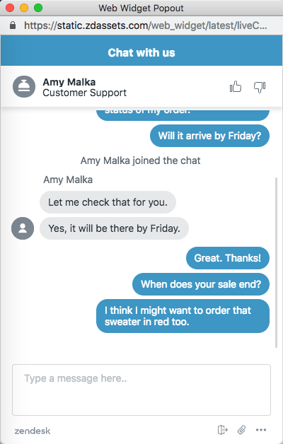
The Web Widget becomes separate from the website and receives a unique URL. It can be moved around and is no longer anchored to the website.
You can share the URL to the Web Widget popout in a range of marketing communications, inviting the user to engage directly with you without having to be on your website.
Phone calls
When Talk is enabled in the Web Widget, the appearance of the launcher to end users depends on which other contact options are enabled.
Launcher appearance Contact options and agent availability 

If Talk is the only contact option enabled in the Web Widget and an agent is online, the launcher includes the Talk icon and says either Request a callback or Call us, depending on your configuration. 
If Talk and the Help Center are enabled in the Web Widget, and an agent is online, the button says Help. 
If Talk, the Help Center, and Chat, or contact forms are enabled in the Web Widget, and agents are online, the launcher includes a question icon and says Help. When the Web Widget opens, the exact appearance of Talk in the Web Widget depends on the how it’s configured by the administrator and the status of agents (see Configuring Zendesk Talk settings for the Web Widget). Depending on your configuration, customers can:
- View a phone number that they can call
- Request a callback
- View the average wait time for a callback
The following examples show how Talk in the Web Widget might appear, depending on your configuration.


If Talk is the only option enabled in the Web Widget and it is configured to allow callback requests, and then you click the launcher, the callback form displays. If Talk is the only contact option enabled and Talk is configured for Call Us only, your phone number displays. 

If Talk and the Help Center are enabled, and other contact options are enabled (for example, Chat or contact form), after a Help Center search the customer can access Talk from the Contact us button. If Talk and the Help Center are enabled, and Chat and contact form are disabled, after a Help Center search the Contact us button says Request a callback (or Call us) instead. Contact forms
Your customers can submit a ticket from the Web Widget to receive an email reply to their inquiry. The contact form is enabled in the Web Widget by default.

By default, the contact form includes fields for the customer’s name, email address, and a description of the problem. If the administrator enabled multiple ticket forms in the Web Widget (see Configuring the components in your Web Widget), then the customer can choose from multiple ticket forms. If not, then only the default contact form appears.
Tickets submitted through the Web Widget contain the tag
web_widget. -
Configuring Web Widget components
Before you add the Web Widget to your website or Help Center, you need to decide which components you want to include in the Web Widget and then turn them on. For some components, you might need to go a step further and configure additional settings. You must be an administrator to configure components in Web Widget.
You can configure the Web Widget to include any combination of these components:
- Help Center search and suggested articles
- Zendesk Chat for live chat with an agent
- Zendesk Talk for requesting a callback from an agent or viewing a phone number to call
- Contact forms for filing a ticket
Configuring the Web Widget
The Web Widget includes multiple components that you can turn on or off, or customize. For example, you can add help, talk, and chat features, and contact forms. You can configure security settings, change the color of buttons and text, edit user interface text, and reposition Web Widget. If you have an Enterprise account, you can remove the Zendesk logo.
For detailed information about the components you can configure, see Configurable Web Widget components (below).
To configure the Web Widget
-
Click the Admin icon (
) in the sidebar and then navigate to Channels > Widget.If you are setting up the Web Widget for the first time, a wizard guides you through the process. Follow the on-screen prompts. After you complete the wizard, you can view and change your options, if you want, by proceeding to the next step.
If this isn’t your first time setting up the Web Widget, skip this step. The wizard doesn’t appear for you.
-
From the Customization tab, configure your Web Widget components (see Configurable Web Widget components below).
-
When you’re done configuring components, click Save.
Allow 10 minutes for changes to the Web Widget to propagate and appear in the Web Widget.
Once you’re done with this procedure, you’re ready to complete the steps described in Adding the Web Widget to your website or Help Center, if you haven’t already.
Configurable Web Widget components
This table lists the Web Widget components that you can configure from Support.
If you want to customize the Web Widget further, it’s possible to do that using the Web Widget API, but you might need the help of a website developer. For more information, see Advanced customization of the Web Widget.
-
Contact form
To allow customers to submit tickets from the Web Widget, leave the toggle on. This option is on by default. If you don’t want customers to be able to submit tickets from the Web Widget, turn the toggle off. Tickets submitted through the Web Widget contain the tag “web_widget.”
You can use these options to control the name field in the default contact form and ticket forms that appear in the Web Widget.
- Show name field - Causes the name field to appear in the forms in the Web Widget. To remove the name field from forms in the Web Widget, clear this check box. By default, this option is on when the Contact form toggle is turned on.
- Required - Makes the name field a required field that users must complete before they can submit the default contact form through the Web Widget. To make the name field a required field, select this check box. Otherwise, the name field is labelled as optional. By default, this option is off when the Contact form toggle is turned on.

Keep in mind that if the Ticket forms toggle is on, ticket forms replace the default contact form in the Web Widget.
-
Ticket forms
To include multiple ticket forms in the Web Widget, turn the toggle on. This option only appears if the Contact form toggle is turned on.
Multiple ticket forms are available on the Support Enterprise plan, or as a Professional add-on feature.
This option enables the end user to select any of your active ticket forms, instead of seeing only the default ticket form, and allows you to customize which ticket forms are available based on the page the user’s on.
If you need to set up ticket forms, click the Settings link. For more information, see Using custom ticket fields and ticket forms with the Web Widget.
-
Custom ticket fields
To select custom ticket fields that you want to include in the Web Widget contact form, use the drop-down list.
This option only appears if you enable the contact form or if you don’t have custom ticket fields that are visible and editable to end-users. To make a custom field available for the Web Widget, select For end-users: Visible and For end-users: Editable in the custom fields settings (see Adding a custom ticket field).
If you need to set up custom ticket fields, click the Settings link. For more information, see Using custom ticket fields and ticket forms with the Web Widget.
-
Chat
To include Chat features in the Web Widget, turn the Chat toggle on.
You must have a Chat account to add Chat functions to the Web Widget. If you don’t have a Chat account, turning this toggle on has no effect.
You can click the Settings link to open the Chat dashboard (the Zendesk Chat product interface), or open Chat from a browser. From there, you will configure specific Chat features for use with the Web Widget (see Setting up Zendesk Chat in the Web Widget).
If you have multiple brands, it doesn’t matter which Chat > Settings link you use. They all open Chat in exactly the same manner. If you have multiple brands, the brand name is added as a chat tag. For more information, see Step 2, add the Web Widget to your brands in Zendesk in the Multibrand setup article.
You cannot add third-party chat applications to the Web Widget.
-
Help Center
You must have a Guide account to add Help Center search to the Web Widget. If you don’t have a Guide account, turning on this toggle has no effect.
To add Help Center search to the Web Widget, turn the toggle on.
To configure Help Center search settings, click the Settings link. Guide will open and you’ll configure settings from there.
If Help Center search is enabled in the Web Widget, you can filter metrics for article views and searches that originate from the Web Widget.
Including restricted articles in Help Center search results
If you want to include restricted Help Center content in your Web Widget results, you need to configure some other settings as well.
-
Contextual Help
To include Contextual Help in the Web Widget, turn the toggle on.
This option only appears when the Help Center toggle is turned on.
Contextual Help suggests articles to the end-user that may be relevant to them, based on the page from which they accessed the Web Widget.
-
Security settings
To restrict Help Center search results in the Web Widget to authenticated users on your website, click the Configure button and then follow the on-screen instructions.
-
Talk
To include Talk in the Web Widget, turn the toggle on.
To configure Talk settings, click the Settings link. For more information, see Configuring Zendesk Talk settings for the Web Widget.
You must have Talk Team, Professional, or Enterprise to add Talk functions to the Web Widget. If you have Talk Lite, this option is not available.
-
Zendesk logo
To remove the Zendesk logo in the Web Widget, turn the toggle off.
This option appears only on Enterprise accounts.
-
Theme color
To specify a custom color for the Web Widget, use the color picker. After you choose the color, you can close the color picker by clicking away, on any other part of the interface.
-
Theme text color
To specify a custom color for the text in the launcher, contact button, and header, use the color picker. After you choose the color, you can close the color picker by clicking away, on any other part of the interface.

If you select the Use default color based on theme check box, the Web Widget automatically chooses the text color for you based on the theme color and using an algorithm to guarantee a minimum contrast ratio as specified by the WCAG guidelines.
-
Position
To choose a position for the Web Widget, select a position from the drop-down list. If you want the Web Widget to appear in the bottom-right corner of the page, choose Right. If you want it to appear in the lower-left corner, choose Left instead.
-
Web Widget button text
To specify the text on the Web Widget button, choose one of the options from the drop-down list.
-
Contact form button text
To specify the text on the button that launches the contact form, choose one of the options from the drop-down list.

-
Answer Bot
To add Answer Bot to your Web Widget, turn the toggle on.
This option only appears when the Help Center toggle is turned on.
Answer Bot is a Guide Professional and Enterprise add-on feature.
For more information, see Enabling and using Answer Bot in the Web Widget.
-
Adding the Web Widget to a website
The Web Widget can be added to any page of your website or to your Help Center.
The Web Widget is fully optimized for the mobile experience and does not affect page load times. The widget is presented in the end user’s language, according to the language setting for end user’s web browser. You can force the widget to always appear in a specific language (see Displaying your widget in a different language).
You cannot use SSO authentication in the Web Widget itself. However, you can restrict access by setting up SSO on your Help Center, or on the website hosting the widget. See Single sign-on options in Zendesk and Using restricted Help Center content with the Web Widget.
Adding the widget to your website
You can add the Web Widget to any page of your website. After you add the code, you manage changes in Zendesk Support and with the Advanced Customization JavaScript APIs, and updates are reflected in the widget wherever it appears.
To add the Web Widget to your website
- Click the Admin icon () in the sidebar, then select Channels > Widget.
- Click the Setup tab, if it is not already selected.
- Under the code box, click Copy to clipboard.
- If you want to add the widget to your website, go to the web page where you want to add the widget, then paste the code before the closing HTML
</body>tag. Add the code to every web page where you want the widget to appear.
If you haven’t already, make sure you configure the components in your widget. For information about configuring the Web Widget using JavaScript APIs, see the developer docs.
If the Web Widget does not appear on pages outside your Help Center, you most likely have the Require sign in option enabled in your Guide security settings (see Restricting Help Center access to signed-in end-users).
The Web Widget displays Help Center content that the user is allowed to see. When Require sign in is enabled, and only the Help Center and Contextual Help toggles are on in your Web Widget admin settings, the Web Widget will not load for non-authenticated users. If you enabled other options in your Web Widget admin settings, such as Contact form, the Web Widget does appear.
Adding the widget to your Help Center
You can add the Web Widget to your Help Center, so that it appears on every page of your Help Center. If you’re on the Team, Professional, or Enterprise Support plan, you can restrict the pages where the Web Widget appears in your Help Center by using the Web Widget API.
To add the Web Widget to your Help Center
- Click the Admin icon () in the sidebar, then select Channels > Widget.
- Click the Setup tab, if it is not already selected.
-
Click the Add to Help Center toggle.

This adds the Web Widget to the Help Center header document_head.hbs, and displays the widget on every page of your Help Center. For more information, see Customizing your Help Center theme (Guide Professional and Enterprise).
If you’re on the Team, Professional, or Enterprise Support plan, you can restrict the pages where the Web Widget appears in your Help Center by using the zE.hide() method of the Web Widget API. See Advanced Customization of your Web Widget and the Web Widget API documentation for more information.
- Click the Admin icon (
-
Customizing the appearance of the Web Widget
You can modify the appearance of some or all of the following widget elements to match the look and feel of your company’s website.
If you’re using a Legacy Chat version, see (Legacy Chat) Customizing the appearance of your widget.
The following elements can be modified via the Chat dashboard, under the Appearance tab:
- Chat Window, which includes the title bar text or mobile widget configurations, depending on your version of Chat.
- Concierge, what Chat visitors see before connected to an agent.
- Message Style (Team, Professional, and Enterprise plans only), display options for outgoing Chat messages.
- Chat Badge (Chat Standalone only), how the widget looks before a chat is started.
To customize the widget’s appearance
- From the Chat dashboard, go to Settings > Widget and click the Appearance tab.
- Customize the options as described in the sections below.
- Preview your changes in the Preview pane on the right. The changes displayed in the Preview pane depends on which version of Chat you are using. Expected Preview pane behavior for each section in the Appearance tab is described in the sections below.
- Click Save Changes.
Customizing the Chat Window section
The Chat Window section is where you configure elements related to the frame around a chat between an agent and a customer. The options you see here depend on which version of Chat you’re using.
Chat + Support in the Web Widget users
Here, you can customize the Top Title Chat Window element. This text appears on the top of your chat window. The following example shows the top title with the text “Chat with us”:

Standalone Chat in the Web Widget users

Here, you can customize the following Chat Window elements:
-
Top Title: This text appears on the top of your chat window. The following example shows the top title with the text “Chat with us”:
- Theme Color: This is the color your widget is outlined in. Enter a hex code or click the swatch to manually select a color.
- Widget Position: Select whether the widget should appear on the bottom right or bottom left of pages you add it to.
Chat widget users

Here, you can customize the mobile widget:
-
Overlay window: The chat window opens on top of your mobile site in the same tab (recommended).
-
Chat Popout: The chat window opens in a new tab.
Customizing the Concierge section
Before visitors connect with a support agent, they see the avatar, name, and byline of the chat Concierge.

-
Display Title and Byline: This text appears at the top of the chat window. The following example shows the Display Title “Live Support” and the byline “Ask us anything”.

-
Avatar (Team, Professional, and Enterprise plans only): Upload a custom image of the avatar you want to appear for your chat Concierge.
Customizing the Message Style section

These options are available only on Team, Professional, and Enterprise plans.
-
Message Style: With the Speech Bubbles option, bubbles appear around each chat sent. Simple Lines just shows the text.
-
Show Avatars: Check this box to show agents’ and visitors’ avatars next to each chat they send.
Customizing the Chat Badge section (Chat standalone users)
The chat badge is how the widget looks before a chat is started.

-
On or Off: Enable or disable the chat badge.
-
Image Right, Image Left, or Text Only: These options determine how the layout of the chat badge looks. Image Right and Image Left use the default chat bubble image, which you can see in the Preview pane.
-
Custom Image: To use your own image, select Custom Image and upload an image in the Image field below.
-
Background Color: Enter a hex code or click the swatch to manually select a color for the chat badge background. To use the same color as the Theme Color from the Chat Window section, check the Same as Theme Color box.
-
Message: This text appears inside the chat badge before your visitors click on it. The following example shows the badge with the text “Chat with us”:
-
Image: If you selected Custom Image above, upload an image for your chat badge here.
-
Removing the Web Widget from your website
You can remove individual instances of your widget by deleting the code from the web page or Help Center. You can turn off all instances of the widget by disabling it in Zendesk Support.
To remove the widget from a web page
- Delete the code from the web page.
To remove the widget from your Help Center
- Click the Admin icon () in the sidebar, then select Channels > Widget.
- Click the Setup tab.
- Click the Add to Help Center toggle to remove the widget.
To disable the widget and prevent it from appearing on your website and Help Center
- Click the Admin icon () in the sidebar, then select Channels > Widget.
-
Click the Customization tab.
-
Beside Contact form, Chat, and Help Center, click each toggle to Off.

All three widget components must be turned off.
- Click Save. The widget will not appear on your website or Help Center.