Search
Customizing the Web Widget
-
Using the Web Widget
With the Web Widget, you can add customer support features from Zendesk Guide, Support, Talk, and Chat to your website or Help Center, so that your customers can get immediate help from a single interface, in whatever form they like best.
Here are the ways that your customers can get help from the Web Widget:
- Search Help Center articles for immediate self-service.
- Submit a support request using a contact form.
- Request a callback, or view a phone number that they can call instead.
- Start a live chat with an agent.
About the Web Widget
The Web Widget is a separate web application that you embed in a web page that gives customers access your Help Center and the agents in your other Zendesk support channels (Support, Talk, and Chat). It can encourage customers to self-serve, whenever possible, by using Help Center articles. It can also make it easier to get help from an agent by reducing the number of steps required to access a contact form, request a call back, and start a chat.
All of these things can be done from a single interface. The customer doesn’t need to go from your home page to your Help Center, open their email application, or search your website to find a email address to contact you.
You can add the Web Widget to your website or Help Center. It appears in the bottom corner by default.

You must be an administrator to set up and manage the Web Widget.
The first thing you need to do is configure the components you want in the widget (see Configuring the Components in your Web Widget), and then you can add the widget code your website or Help Center (see Adding the Web Widget to your website or Help Center).
For a complete list of documentation about the Web Widget, see Web Widget resources.
Browser requirements for Web Widget
The Web Widget is supported on these browsers.
- Google Chrome: latest two versions
- Microsoft Internet Explorer: Internet Explorer 11 and Edge
- Mozilla Firefox: latest two versions
- Apple Safari: latest version
- iOS Safari: latest two versions
- Android browser: latest version
- Chrome Mobile for Android and iOS: latest version
Understanding the end-user experience
In the Web Widget, you can enable components to combine knowledge base search, live chat, phone calls, and contact forms. The end-user experience depends on what options are enabled and whether agents are online.
When multiple components are enabled in the Web Widget, components are presented to end users in a specific sequence, at different times, rather than all at once.
Components are presented in this order:
- Self service
- Live chat
- Phone calls
- Contact forms
For more information about how visitors can use these components, keep reading.
Self service
If the Help Center is enabled in the Web Widget, customers are presented with Help Center search first. When the Web Widget opens, it includes both self-service and the contact button.

When you search, up to nine results appear, if matches are found. The customer can click an article in the list and it opens in the Web Widget.
If Contextual Help is enabled in the Web Widget, up to three suggested articles appear below the search box. The suggested articles are determined by the page URL from which the customer accessed the Web Widget, or it is chosen by the administrator using advanced customizations (see About Contextual Help for the Web Widget).
Live chat
This is an overview about how Chat in the Web Widget works from a visitor’s perspective. It’s meant to give administrators and agents a general idea about how it works, but it doesn’t cover all scenarios—the exact appearance and behavior of Chat in the Web Widget depends on how it was configured by the administrator.
Visitors to your website can use Chat functions in the Web Widget from a desktop or mobile browser (see Customizing the Chat widget for mobile devices).
Your visitors can perform these chat-related activities from the Web Widget:
- Starting chats from the Web Widget launcher
- Receive proactive chats
- View conversation history
- Customize the avatar, name, and byline of the chat Concierge section
- Send and receive attachments with chats
- Adjust sound, request transcripts, edit contact details, and end chats
- Translate chats
- End and rate chats
- Popping out the Web Widget during chats
For more information, see Setting up Zendesk Chat in the Web Widget.
Starting chats from the Web Widget launcher
When Chat is enabled in the Web Widget, the appearance of the launcher to end users depends on which other contact options are enabled.
Launcher appearance Contact options and agent availability 
If Chat is the only contact option enabled in the Web Widget and a Chat agent is online, the launcher includes the Chat icon and says Chat. 
If Chat and the Help Center are enabled, when a chat agent is online, the launcher includes the Chat icon and says Help. 
The chat badge is a special launcher that allows a customer to get support from a chat agent immediately. It’s larger than the default Web Widget launcher button and it doesn’t include other contact options (see Customizing the Chat Badge section). If the chat badge is enabled, chat is the only contact option enabled in the Web Widget, and a Chat agent is online, the chat badge appears on the page instead of the regular Web Widget launcher. If Chat is the only contact option enabled and no agents are online, the launcher does not display. Once the customer opens the Web Widget, they see this:

When the customer clicks Live chat, what they see next depends on whether the pre-chat form is enabled.

If the pre-chat form is enabled, the customer fills in the form, then clicks Start Chat

If the pre-chat form is not enabled, the customer can start the chat right away.
If an agent is available when the customer clicks the launcher, but the then agent signs off before the chat begin, the customer sees a message indicating that the Chat agent is not available.
Receiving proactive chats
Agents can see who is the currently on your site and decide whether to proactively contact a visitor before they request a chat. For example, you might want to reach out to visitors who have items their shopping cart, but are taking too long to complete their purchases.
Viewing conversation history
If visitor authentication is enabled in the Web Widget, authenticated visitors can see their past chats.

Customize the avatar, name, and byline of the chat Concierge section
Before visitors connect with a support agent, they see the avatar, name, and byline of the chat Concierge.
Sending and receiving attachments with chats
Visitors can send and receive attachments. Clicking the attachments icon (
 ) opens a standard file selection dialog box, but you can also drag and drop files into the Web Widget too.
Adjusting sound, requesting transcripts, editing contact details, and ending chats
Visitors can use the expandable menu at the bottom (
 ) to turn sounds on and off, request a transcript of the chat, edit their contact details, or end the chat.
Translating chats
If Chat detects that the agent and visitor are using different languages, the Show translated link appears in the conversation. Visitors can click this link to translate the agent’s replies into their language. The translation is performed by Google Translate.

Ending and rating chats
When the visitor is ready, they can end the chat by clicking the end chat (
 ) icon. They can also end the chat from the expandable menu ().
Visitors can rate a chat as good or bad using the thumbs up (
 ) and thumbs down (
 ) icons at any time during the chat. After they rate the chat, the Leave a comment button appears, so they can add a comment, if desired.
If the visitor doesn’t rate the chat after a little while, the agent can prompt the visitor to rate the chat by making the Rate this chat button appear.
Popping out the Web Widget during chats
When Chat is enabled in the Web Widget, visitors can click the pop-out icon (
 ) to pop-out the Web Widget to it’s own browser window.
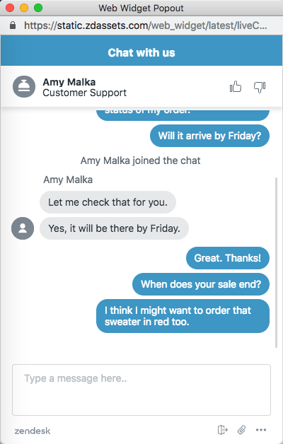
The Web Widget becomes separate from the website and receives a unique URL. It can be moved around and is no longer anchored to the website.
You can share the URL to the Web Widget popout in a range of marketing communications, inviting the user to engage directly with you without having to be on your website.
Phone calls
When Talk is enabled in the Web Widget, the appearance of the launcher to end users depends on which other contact options are enabled.
Launcher appearance Contact options and agent availability 

If Talk is the only contact option enabled in the Web Widget and an agent is online, the launcher includes the Talk icon and says either Request a callback or Call us, depending on your configuration. 
If Talk and the Help Center are enabled in the Web Widget, and an agent is online, the button says Help. 
If Talk, the Help Center, and Chat, or contact forms are enabled in the Web Widget, and agents are online, the launcher includes a question icon and says Help. When the Web Widget opens, the exact appearance of Talk in the Web Widget depends on the how it’s configured by the administrator and the status of agents (see Configuring Zendesk Talk settings for the Web Widget). Depending on your configuration, customers can:
- View a phone number that they can call
- Request a callback
- View the average wait time for a callback
The following examples show how Talk in the Web Widget might appear, depending on your configuration.


If Talk is the only option enabled in the Web Widget and it is configured to allow callback requests, and then you click the launcher, the callback form displays. If Talk is the only contact option enabled and Talk is configured for Call Us only, your phone number displays. 

If Talk and the Help Center are enabled, and other contact options are enabled (for example, Chat or contact form), after a Help Center search the customer can access Talk from the Contact us button. If Talk and the Help Center are enabled, and Chat and contact form are disabled, after a Help Center search the Contact us button says Request a callback (or Call us) instead. Contact forms
Your customers can submit a ticket from the Web Widget to receive an email reply to their inquiry. The contact form is enabled in the Web Widget by default.

By default, the contact form includes fields for the customer’s name, email address, and a description of the problem. If the administrator enabled multiple ticket forms in the Web Widget (see Configuring the components in your Web Widget), then the customer can choose from multiple ticket forms. If not, then only the default contact form appears.
Tickets submitted through the Web Widget contain the tag
web_widget. -
Configuring Web Widget components
Before you add the Web Widget to your website or Help Center, you need to decide which components you want to include in the Web Widget and then turn them on. For some components, you might need to go a step further and configure additional settings. You must be an administrator to configure components in Web Widget.
You can configure the Web Widget to include any combination of these components:
- Help Center search and suggested articles
- Zendesk Chat for live chat with an agent
- Zendesk Talk for requesting a callback from an agent or viewing a phone number to call
- Contact forms for filing a ticket
Configuring the Web Widget
The Web Widget includes multiple components that you can turn on or off, or customize. For example, you can add help, talk, and chat features, and contact forms. You can configure security settings, change the color of buttons and text, edit user interface text, and reposition Web Widget. If you have an Enterprise account, you can remove the Zendesk logo.
For detailed information about the components you can configure, see Configurable Web Widget components (below).
To configure the Web Widget
-
Click the Admin icon (
 ) in the sidebar and then navigate to Channels > Widget.
If you are setting up the Web Widget for the first time, a wizard guides you through the process. Follow the on-screen prompts. After you complete the wizard, you can view and change your options, if you want, by proceeding to the next step.
If this isn’t your first time setting up the Web Widget, skip this step. The wizard doesn’t appear for you.
-
From the Customization tab, configure your Web Widget components (see Configurable Web Widget components below).
-
When you’re done configuring components, click Save.
Allow 10 minutes for changes to the Web Widget to propagate and appear in the Web Widget.
Once you’re done with this procedure, you’re ready to complete the steps described in Adding the Web Widget to your website or Help Center, if you haven’t already.
Configurable Web Widget components
This table lists the Web Widget components that you can configure from Support.
If you want to customize the Web Widget further, it’s possible to do that using the Web Widget API, but you might need the help of a website developer. For more information, see Advanced customization of the Web Widget.
-
Contact form
To allow customers to submit tickets from the Web Widget, leave the toggle on. This option is on by default. If you don’t want customers to be able to submit tickets from the Web Widget, turn the toggle off. Tickets submitted through the Web Widget contain the tag “web_widget.”
You can use these options to control the name field in the default contact form and ticket forms that appear in the Web Widget.
- Show name field - Causes the name field to appear in the forms in the Web Widget. To remove the name field from forms in the Web Widget, clear this check box. By default, this option is on when the Contact form toggle is turned on.
- Required - Makes the name field a required field that users must complete before they can submit the default contact form through the Web Widget. To make the name field a required field, select this check box. Otherwise, the name field is labelled as optional. By default, this option is off when the Contact form toggle is turned on.

Keep in mind that if the Ticket forms toggle is on, ticket forms replace the default contact form in the Web Widget.
-
Ticket forms
To include multiple ticket forms in the Web Widget, turn the toggle on. This option only appears if the Contact form toggle is turned on.
Multiple ticket forms are available on the Support Enterprise plan, or as a Professional add-on feature.
This option enables the end user to select any of your active ticket forms, instead of seeing only the default ticket form, and allows you to customize which ticket forms are available based on the page the user’s on.
If you need to set up ticket forms, click the Settings link. For more information, see Using custom ticket fields and ticket forms with the Web Widget.
-
Custom ticket fields
To select custom ticket fields that you want to include in the Web Widget contact form, use the drop-down list.
This option only appears if you enable the contact form or if you don’t have custom ticket fields that are visible and editable to end-users. To make a custom field available for the Web Widget, select For end-users: Visible and For end-users: Editable in the custom fields settings (see Adding a custom ticket field).
If you need to set up custom ticket fields, click the Settings link. For more information, see Using custom ticket fields and ticket forms with the Web Widget.
-
Chat
To include Chat features in the Web Widget, turn the Chat toggle on.
You must have a Chat account to add Chat functions to the Web Widget. If you don’t have a Chat account, turning this toggle on has no effect.
You can click the Settings link to open the Chat dashboard (the Zendesk Chat product interface), or open Chat from a browser. From there, you will configure specific Chat features for use with the Web Widget (see Setting up Zendesk Chat in the Web Widget).
If you have multiple brands, it doesn’t matter which Chat > Settings link you use. They all open Chat in exactly the same manner. If you have multiple brands, the brand name is added as a chat tag. For more information, see Step 2, add the Web Widget to your brands in Zendesk in the Multibrand setup article.
You cannot add third-party chat applications to the Web Widget.
-
Help Center
You must have a Guide account to add Help Center search to the Web Widget. If you don’t have a Guide account, turning on this toggle has no effect.
To add Help Center search to the Web Widget, turn the toggle on.
To configure Help Center search settings, click the Settings link. Guide will open and you’ll configure settings from there.
If Help Center search is enabled in the Web Widget, you can filter metrics for article views and searches that originate from the Web Widget.
Including restricted articles in Help Center search results
If you want to include restricted Help Center content in your Web Widget results, you need to configure some other settings as well.
-
Contextual Help
To include Contextual Help in the Web Widget, turn the toggle on.
This option only appears when the Help Center toggle is turned on.
Contextual Help suggests articles to the end-user that may be relevant to them, based on the page from which they accessed the Web Widget.
-
Security settings
To restrict Help Center search results in the Web Widget to authenticated users on your website, click the Configure button and then follow the on-screen instructions.
-
Talk
To include Talk in the Web Widget, turn the toggle on.
To configure Talk settings, click the Settings link. For more information, see Configuring Zendesk Talk settings for the Web Widget.
You must have Talk Team, Professional, or Enterprise to add Talk functions to the Web Widget. If you have Talk Lite, this option is not available.
-
Zendesk logo
To remove the Zendesk logo in the Web Widget, turn the toggle off.
This option appears only on Enterprise accounts.
-
Theme color
To specify a custom color for the Web Widget, use the color picker. After you choose the color, you can close the color picker by clicking away, on any other part of the interface.
-
Theme text color
To specify a custom color for the text in the launcher, contact button, and header, use the color picker. After you choose the color, you can close the color picker by clicking away, on any other part of the interface.

If you select the Use default color based on theme check box, the Web Widget automatically chooses the text color for you based on the theme color and using an algorithm to guarantee a minimum contrast ratio as specified by the WCAG guidelines.
-
Position
To choose a position for the Web Widget, select a position from the drop-down list. If you want the Web Widget to appear in the bottom-right corner of the page, choose Right. If you want it to appear in the lower-left corner, choose Left instead.
-
Web Widget button text
To specify the text on the Web Widget button, choose one of the options from the drop-down list.
-
Contact form button text
To specify the text on the button that launches the contact form, choose one of the options from the drop-down list.

-
Answer Bot
To add Answer Bot to your Web Widget, turn the toggle on.
This option only appears when the Help Center toggle is turned on.
Answer Bot is a Guide Professional and Enterprise add-on feature.
For more information, see Enabling and using Answer Bot in the Web Widget.
-
Adding the Web Widget to a website
The Web Widget can be added to any page of your website or to your Help Center.
The Web Widget is fully optimized for the mobile experience and does not affect page load times. The widget is presented in the end user’s language, according to the language setting for end user’s web browser. You can force the widget to always appear in a specific language (see Displaying your widget in a different language).
You cannot use SSO authentication in the Web Widget itself. However, you can restrict access by setting up SSO on your Help Center, or on the website hosting the widget. See Single sign-on options in Zendesk and Using restricted Help Center content with the Web Widget.
Adding the widget to your website
You can add the Web Widget to any page of your website. After you add the code, you manage changes in Zendesk Support and with the Advanced Customization JavaScript APIs, and updates are reflected in the widget wherever it appears.
To add the Web Widget to your website
- Click the Admin icon () in the sidebar, then select Channels > Widget.
- Click the Setup tab, if it is not already selected.
- Under the code box, click Copy to clipboard.
- If you want to add the widget to your website, go to the web page where you want to add the widget, then paste the code before the closing HTML
</body>tag. Add the code to every web page where you want the widget to appear.
If you haven’t already, make sure you configure the components in your widget. For information about configuring the Web Widget using JavaScript APIs, see the developer docs.
If the Web Widget does not appear on pages outside your Help Center, you most likely have the Require sign in option enabled in your Guide security settings (see Restricting Help Center access to signed-in end-users).
The Web Widget displays Help Center content that the user is allowed to see. When Require sign in is enabled, and only the Help Center and Contextual Help toggles are on in your Web Widget admin settings, the Web Widget will not load for non-authenticated users. If you enabled other options in your Web Widget admin settings, such as Contact form, the Web Widget does appear.
Adding the widget to your Help Center
You can add the Web Widget to your Help Center, so that it appears on every page of your Help Center. If you’re on the Team, Professional, or Enterprise Support plan, you can restrict the pages where the Web Widget appears in your Help Center by using the Web Widget API.
To add the Web Widget to your Help Center
- Click the Admin icon () in the sidebar, then select Channels > Widget.
- Click the Setup tab, if it is not already selected.
-
Click the Add to Help Center toggle.

This adds the Web Widget to the Help Center header document_head.hbs, and displays the widget on every page of your Help Center. For more information, see Customizing your Help Center theme (Guide Professional and Enterprise).
If you’re on the Team, Professional, or Enterprise Support plan, you can restrict the pages where the Web Widget appears in your Help Center by using the zE.hide() method of the Web Widget API. See Advanced Customization of your Web Widget and the Web Widget API documentation for more information.
- Click the Admin icon (
-
Customizing the appearance of the Web Widget
You can modify the appearance of some or all of the following widget elements to match the look and feel of your company’s website.
If you’re using a Legacy Chat version, see (Legacy Chat) Customizing the appearance of your widget.
The following elements can be modified via the Chat dashboard, under the Appearance tab:
- Chat Window, which includes the title bar text or mobile widget configurations, depending on your version of Chat.
- Concierge, what Chat visitors see before connected to an agent.
- Message Style (Team, Professional, and Enterprise plans only), display options for outgoing Chat messages.
- Chat Badge (Chat Standalone only), how the widget looks before a chat is started.
To customize the widget’s appearance
- From the Chat dashboard, go to Settings > Widget and click the Appearance tab.
- Customize the options as described in the sections below.
- Preview your changes in the Preview pane on the right. The changes displayed in the Preview pane depends on which version of Chat you are using. Expected Preview pane behavior for each section in the Appearance tab is described in the sections below.
- Click Save Changes.
Customizing the Chat Window section
The Chat Window section is where you configure elements related to the frame around a chat between an agent and a customer. The options you see here depend on which version of Chat you’re using.
Chat + Support in the Web Widget users
Here, you can customize the Top Title Chat Window element. This text appears on the top of your chat window. The following example shows the top title with the text “Chat with us”:

Standalone Chat in the Web Widget users

Here, you can customize the following Chat Window elements:
-
Top Title: This text appears on the top of your chat window. The following example shows the top title with the text “Chat with us”:
- Theme Color: This is the color your widget is outlined in. Enter a hex code or click the swatch to manually select a color.
- Widget Position: Select whether the widget should appear on the bottom right or bottom left of pages you add it to.
Chat widget users

Here, you can customize the mobile widget:
-
Overlay window: The chat window opens on top of your mobile site in the same tab (recommended).
-
Chat Popout: The chat window opens in a new tab.
Customizing the Concierge section
Before visitors connect with a support agent, they see the avatar, name, and byline of the chat Concierge.

-
Display Title and Byline: This text appears at the top of the chat window. The following example shows the Display Title “Live Support” and the byline “Ask us anything”.

-
Avatar (Team, Professional, and Enterprise plans only): Upload a custom image of the avatar you want to appear for your chat Concierge.
Customizing the Message Style section

These options are available only on Team, Professional, and Enterprise plans.
-
Message Style: With the Speech Bubbles option, bubbles appear around each chat sent. Simple Lines just shows the text.
-
Show Avatars: Check this box to show agents’ and visitors’ avatars next to each chat they send.
Customizing the Chat Badge section (Chat standalone users)
The chat badge is how the widget looks before a chat is started.

-
On or Off: Enable or disable the chat badge.
-
Image Right, Image Left, or Text Only: These options determine how the layout of the chat badge looks. Image Right and Image Left use the default chat bubble image, which you can see in the Preview pane.
-
Custom Image: To use your own image, select Custom Image and upload an image in the Image field below.
-
Background Color: Enter a hex code or click the swatch to manually select a color for the chat badge background. To use the same color as the Theme Color from the Chat Window section, check the Same as Theme Color box.
-
Message: This text appears inside the chat badge before your visitors click on it. The following example shows the badge with the text “Chat with us”:
-
Image: If you selected Custom Image above, upload an image for your chat badge here.
-
Removing the Web Widget from your website
You can remove individual instances of your widget by deleting the code from the web page or Help Center. You can turn off all instances of the widget by disabling it in Zendesk Support.
To remove the widget from a web page
- Delete the code from the web page.
To remove the widget from your Help Center
- Click the Admin icon () in the sidebar, then select Channels > Widget.
- Click the Setup tab.
- Click the Add to Help Center toggle to remove the widget.
To disable the widget and prevent it from appearing on your website and Help Center
- Click the Admin icon () in the sidebar, then select Channels > Widget.
-
Click the Customization tab.
-
Beside Contact form, Chat, and Help Center, click each toggle to Off.

All three widget components must be turned off.
- Click Save. The widget will not appear on your website or Help Center.